How to blend text into a photo realistically in Adobe Photoshop tutorial
This Photoshop tutorial shows you how to add type so that it loooks like it’s part of the photo. You will learn several things here including:
- How to add type to a photo
- How to sample color
- How to distress type
- how to warp text to fit a shape
- How to use blending modes to add realism
- how to add depth with layer styles
Thanks for checking out this week’s tutorial.
How to Add Realistic Text to a Photo in Adobe Photoshop. Also works on Illustrations.
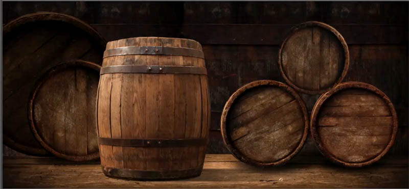
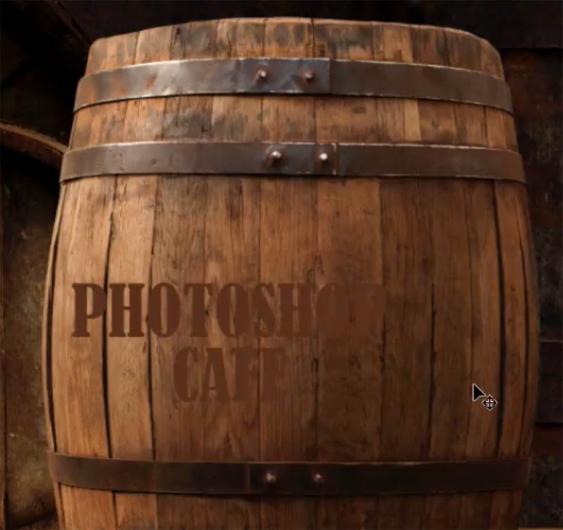
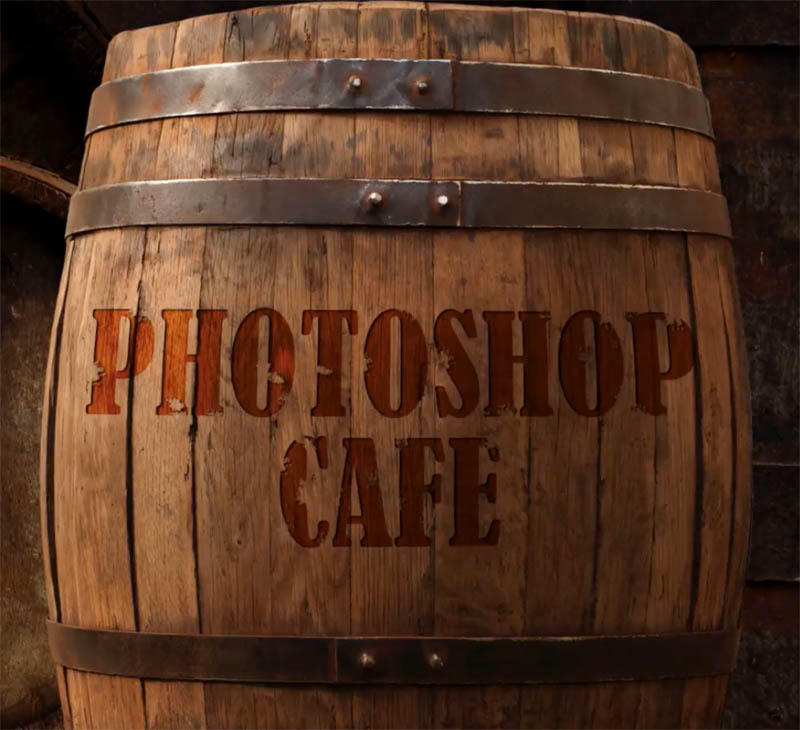
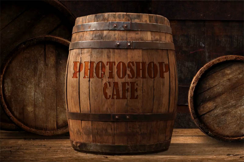
Hey Cafe Crew, it’s Colin Smith here and this week, I’m going to show you how to add some text to this barrel that make it look realistic like it was kind of engraved in there. So I’m just going to take advantage of some Blending Modes and some different things inside of Photoshop.
Create and color the text
Step 1
Open photo (Or illustration) you will use.
Step 2.
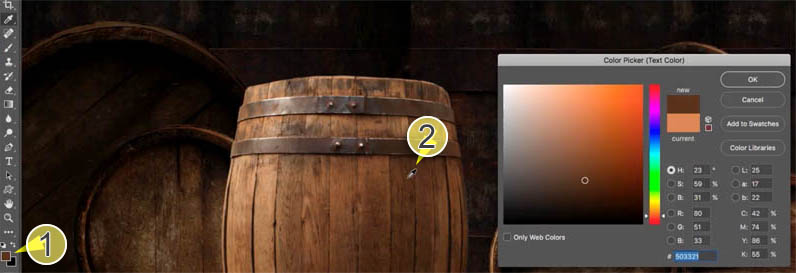
Let’s select a color.
We will use a color from the photo. Grab the Color Picker, using the Eyedropper to sample the darker wood on that barrel.
Step 3.
Choose the the Type Tool. I’m using a condensed font, it’s Bernard MT Condensed.
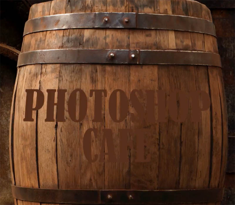
And I’m going to type in PHOTOSHOP CAFE, and drag it into position.
Step 4
The quickest way to resize the text is to hit Ctrl T, that would be Command T on Mac, move to the corner, hold down the Shift key to constrain it and then drag it out in proportion to fill up that barrel.
Hit Enter now to apply it.
Making the text wrap around the object
There’s two things we need to do:
- One, we want to make it wrap around the shape a little bit
- We really want to kind of make it look like it’s not just stuck on there, but it’s actually part of the texture so it’s actually textured
Step 5
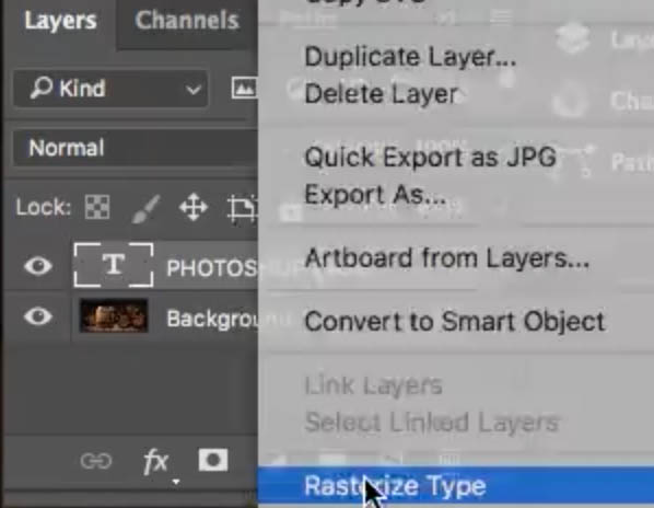
Right click on the type layer In the Layers panel and then choose Rasterize Type. This will convert it to pixels so that we can distort those pixels.
Step 6
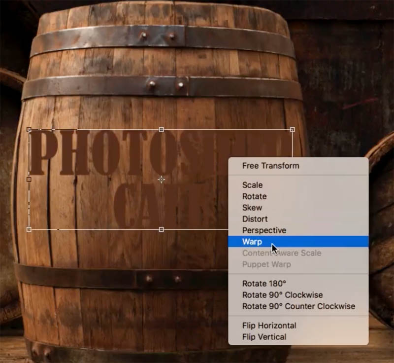
Hit Ctrl/Cmd + T; for free Transform.
Right click and choose Warp because it enables us to match curves and it works nicely on rounded surfaces. (Now we don’t have to rasterize the type to use warp, but some of the other things we are going to do, we will need the type rasterized).
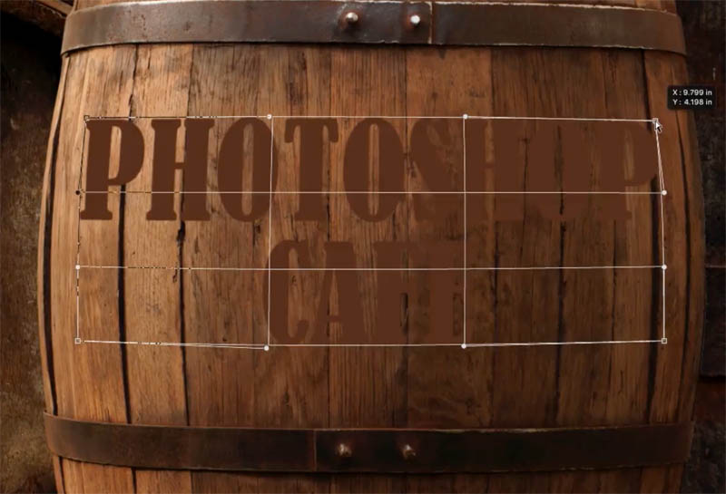
Grab the middle part and pull it down a little bit, so it’s just kind of bulging a little bit more in the middle.
Pull down on the edges to make it look like it’s following the contour. Tip: With the Warp Tool, you can click on the points OR you can drag inside the mesh to make it work.
Hit Enter to apply it .
Blending the texture into the type in photoshop
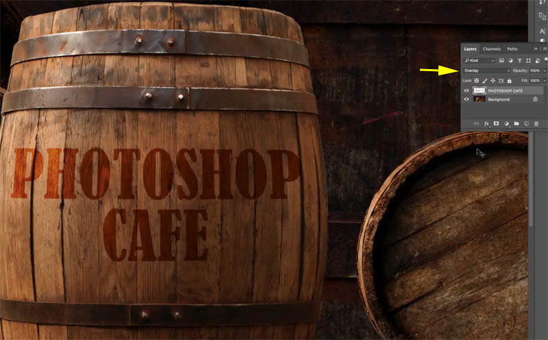
The last thing we need to do is blend the type into the texture, we’re going to change the Blend Mode.
Step 7
On the top of the Layers panel you will see the word “normal” this is the layer blending mode. (Download my free ebook on Layer blending modes to fully understand them).
Change the blending mode to Overlay Blend Mode. That’s working pretty well, Now we can see the wood texture coming through the text, and it doesn’t look just stuck there anymore.
These are the basic steps. For extra realism, read on!
Xtra Credit: Upping the realism of Photoshop text with rough edges and an embossed look.
Now we will roughen it up a little bit.
Step 8
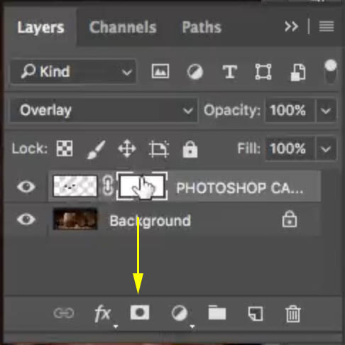
Create a Layer Mask on the type layer, by selecting the type layer and clicking the Layer Mask button in the bottom of the Layers panel. (The rectangle icon with the circle in it)
Press the D key to Choose black as a foreground color.
Hit the B key to choose the Brush Tool. Make sure Opacity is all the way to 100 and Blend Mode is in Normal.
We’re going to find a rough brush. If you look at the top options bar, click the brush in the top left. You will see a panel with a gear. Click on the gear icon.
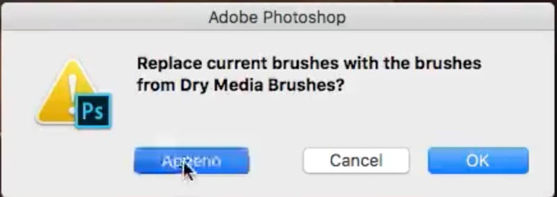
Now, you can load in different types of brushes from the list that appears. You’ll see, dry medium brushes, choose them.
Select append from the options that appear.
step 9
Grab a rough edged brush. When you paint with black on the mask, You are just of nibbling at those edges a little bit to create a little bit more of a distressed look.
And this is also what you would do if you wanted to just create basic distressed type. Now I’m not going to get too carried away because I don’t want it to be too beaten up and distressed, but you get the general idea.
Tip: You can download brushes from places like Brusheezy or DeviantArt and stuff like that, and you could find some custom brushes that would actually do a much better job of this.(Maybe I’ll add some to PhotoshopCAFE soon).
Adding 3D Depth to text
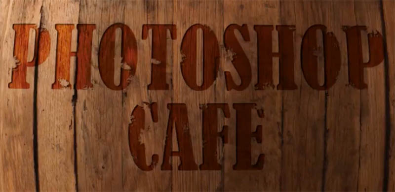
There’s another thing we can do to make it look like it was seared in there a little bit and it’s got a little bit of a depth, like maybe they used a hot brand or something like that.
Step 10
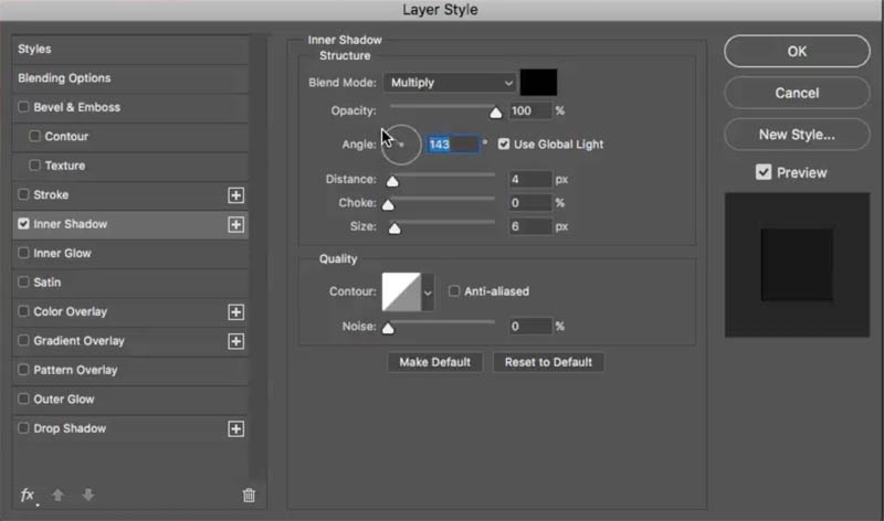
With the type layer selected, click on the little “fx” at the bottom of the layers panel to add a layer style. Choose an Inner Shadow. Turn the Opacity all the way up to 100 and give it a little bit of Distance and see how that gives it that kind of chiseled in look.
Change the angle and you can see it starts to look like it’s chiseled into the wood.
So, anyway, that’s a really simple little tutorial there on how to add Type and make it look a lot more realistic.
Now notice that the Blending Modes play a big part in making this look realistic and there’s a ton of things you can do with Layer Blending Modes. And because of that, I’ve actually created a free e-book for you. There’s no advertising right here. It’s just pure content. Check out that e-book. It gives an example of every single Blending Mode and also a bunch of places where it could be used. Grab the free Layer Blending modes ebook here! (200,000 downloads so far! Yay!)
So anyway, thanks, guys, for checking out this tutorial, don’t forget, leave a comment. Let’s get a discussion going. I do my best to answer all the questions.
I hope you have fun with it and get ready for a new one everyweek!
Dont forget to check out our premium tutorials for unmatched Photoshop learning!
Until next week.
Great to see you here at the CAFE
Colin
PS Don’t forget to follow us on Social Media for more tips.. (I've been posting some fun Instagram and Facebook Stories lately)
You can get my free Layer Blending modes ebook along with dozens of exclusive Photoshop Goodies here
7 thoughts on “How to blend text into a photo realistically in Adobe Photoshop tutorial”
Leave a Reply
How to retouch a portrait photo in Lightroom or Camera RAW. This Lightroom tutorial shows how to smoothen skin, whiten...
How to easily remove a logo from a photo in Photoshop. Learn 2 easy ways to remove logos from clothing...









Colin, thank you for this great tutorial! I have a question for you, and that is, is there an action for creating a typographic portrait out there somewhere? It seems that in most of the tutorials, you have to input the text dozens of times before you can overlay it over the image. There has to be a quicker way to accomplish this. Thank you in advance!
Yes, choose Type>Paste Lorem Ipsum in CC. For earlier versions of Photoshop, just cut and paste text from the web
Thank you – very nice tutorial
Very easy to follow along with you Colin and your the source for me on all things photoshop!
Thanks for taking time for us.
Just came across your tutorial, hope you are still active on here. I need to blend many names to a wall with different colors of art work. Can I follow these same instructions?
I’m alive and well and posting new tutorials here at the CAFE every week
Hi Colin, I’m trying to figure out a way to deform “text” in Ps 2021 to make it look more realistic. But I’m Not working with the text tool. I have a Brush that creates graffiti-looking letters. I painted my graffiti on its own layer with that brush. I opened a free stock Brick Wall as a layer below the graffiti brush words. I changed the Blend Mode on the graffiti layer to Linear Burn. I can’t figure out how to get that brush graffiti layer to look as if it’s bending around the bricks & mortar of the brick wall. I’ve tried Transform > Warp with no luck, still not getting the textural warp (since I don’t know what I’m doing…). Any suggestions – perhaps for a LFL session? Thx!