Texture, Clarity and Dehaze in Lightroom + ACR explained. The Ultimate Comparision
When and where do I use Clarity, or Dehaze or texture in Lightroom and Camera RAW? Answered
Continuing on my deep dive series into the different settings in Lightroom and Adobe Camera RAW (The adjustments on both are identical). This time I break down Texture, Clarity and Dehaze. They aren’t the same. I’ll explain what each does, provide the best times to use each on your photos and then we will wrap up by applying all 3 to an image selectively using masks. For previous tutorials in this series, check out Contrast | Shadow/Highlight vs Black/White
Before we dive in, I want to quickly define 2 terms.
Contrast and Frequency in images
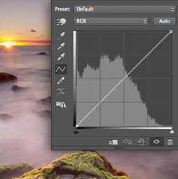
Let’s start with contrast. Contrast=The difference between the lightest and darkest pixels in an image.
On the left side of this photo, you will see the darkest and the lightest pixels.
Because there is a large distance between them (on the grayscale), this is known as high contrast.

Look at the right side of the same photo. There aren’t any real blacks.
The difference between the darkest and lightest part is less. This makes a low contrast image.

Here is an example of full contrast, blacks and whites exist in this image. It looks punchy.

An example of a low contrast image. No true blacks or whites. The image appears softer. There isn’t any right and wrong here. Use what works best of each photo.

Frequency. The details in an image
Max Wendt from Adobe said it the best I’ve heard it. High frequency is the details, mid frequency is the features, while low frequency are the areas.

All that means, areas of fine detail are known as high frequency and areas that have little detail are known as low frequency. Most images contain all the different frequencies.

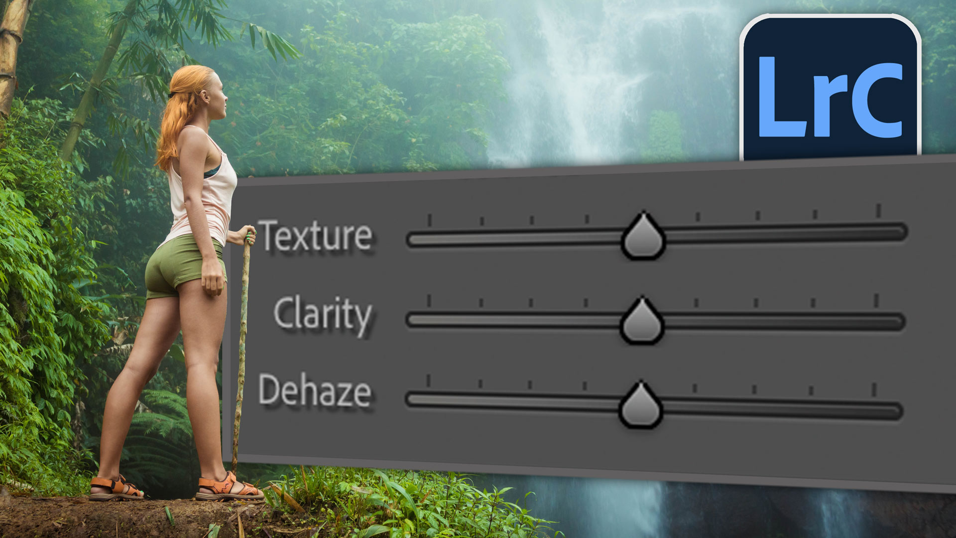
Finding the Texture, Contrast and Dehaze sliders
Both Camera Raw in Photoshop and all the Lightrooms have these 3 sliders.
In LIghtroom Classic they are under the presence portion of the adjustments panel

In Photoshop, choose filter>Camera RAW
You will find them under the Effects panel. When you are in masks in Lightroom and ACR, they are called Effects.

Clarity
Time to demonstrate the 3 sliders and explain them.

I will use this chart on all 3 of the adjustments so you can see how it effects different parts of an image. This isn’r a standard chart, I made it myself for testing purposes.
This is the chart with no adjustments for your reference.

When we increase the clarity, you will notice the image looks sharper and more punchy.
Clarity adjusts the contrast in the midtones of the image (Grays). It doesn’t really affect blacks ands whites as much as midtones. It also adjusts the colors and makes them appear muddy. It adds a grunge to the image at higher settings.
Because of this, it makes details pop.

How clarity works.
Clarity works in a similar way as unsharp mask in Photoshop.
Choose Filter>Sharpen>Unsharp mask

When cranked up too high you can clearly see whats happening. It adds a halo around edges and details. This gives the appearance of sharpening.

Clarity is useful for bringing out details in an image.

Here you can see the details on Chrystal’s shirt as well as the raygun. But be careful, this effect is not flattering on skin. We will address this at the end where we use a brush to apply clarity.

When Clarity first came out, it was widely used as an cartoonish effect known as the Grunge look or the fake HDR look in an attempt to emulate the work of photographer Dave Hill. (Trend followers might not have been aware of Dave Hill by the time it became mainstream, poor Dave).
While it still has it’s place for certain effects (I have a client that loves it, and forces me to use it often under protest), I would suggest against overusing this look unless you are after this particular effect. (I show how to do it on the video at the top, but essentially you crank Clarity, highlights and shadows to the maximum setting).

Another place where Clarity is great is with landscape photos.

Clarity can really bring out details in things like rocks.

Dehaze

Dehaze works mostly on Low frequency areas on an image. It was designed to cut through fog, smog and glare. Dehaze boosts low frequency contrast and saturates the colors.
Notice how it doesn’t really affect the light parts of the image when added. But it really boosts the contrast in the rest of the image. This works well for things like skies as well as cutting through glare. It’s like cleaning a dirty window.

If used in the opposite direction, dehaze can be used to add fog.

Dehaze works well on areas like the waterfall that is losing detail due to the mist.
Remember, the primary goal here isn’t to fix a photo, but to demonstrate what these tools do. (I say this because, someone will say “the waterfall looked better before” and they might be right according to their subjective tastes. while others will prefer the “after” effect. It doesn’t matter, the point is to observe what these tools do so you can use them on totally different images.. your images. I look forward to the day when I don’t have to preface these obvious things, but photographers…).

Here you can see Dehaze affects the washed out area the most. While the whole image is affected, its not as much as the area of low contrast.

If we push the dehaze to the left, it will actually introduce haze.

Dehaze on skies
I love to use dehaze on skies and clouds.

See how it pops the details on the clouds.
But be aware, dehaze also boosts saturation

If we reduce saturation afterwards, we can enjoy the detail of Dehaze without over saturating the colors.

Texture

The newest of the three Presence sliders is Texture. This is actually my choice in most cases and has largely replaced clarity in my personal workflow.
Texture Increases medium frequency contrast and doesn’t affect color too much (because its higher frequency than sharpening, it doesn’t exaggerate noise as much,
See how the details are showing better, but the color isn’t affected.

Texture was originally created by Adobe as a way to soften skin without removing the fine details like pores.

A subtle amount of negative texture can quickly make skin look great without making it look fake. Go too far and it will become plastic looking.

Originally designed to reduce texture, Adobe wondered what would happen if they allowed it to increase texture. What they go was an excellent sharpening effect that pops the textures in images.
Here is an image with texture applied. It brings out the gravel and texture of the road.

Texture works similar to sharpening, but sharpening is applied to finer details than texture.
Here the image has sharpening applied but no texture. See the finer details. This also enhances noise grain if any is present in the image.

The ideal mix is a bit of sharpening and a bit of texture.

Applying Texture, Clarity and Dehaze locally with a Mask brush.
Now for the holy grail. This is how I like to use these 3 adjustments.
Here is the before image. Remember, the goal is to pop the details as a demonstration.

Lets create a mask brush
Click on the mask icon

choose brush

Apply the brush to the low contrast area.

Increase the Dehaze.

Lower the saturation so we are affecting the details and not the color.

Continue to paint on the areas of the image that you want to cut through haze.

Add a second mask for Clarity.
Click> Create New Mask and choose brush

Add some clarity.

Paint over the bamboo and the leaves on the left to pop the details. You cam also paint over some of the areas we app;ied dehaze and see how combining these reveals a lot of detail. (The video at the top of the page shows this very well).

Add a third brush.
Increase texture

Paint over the ground and details in the leaves on the left. Even add a little texture to the model.
Texture is my go to tool for a lot of detail, but also combine it with sharpening.

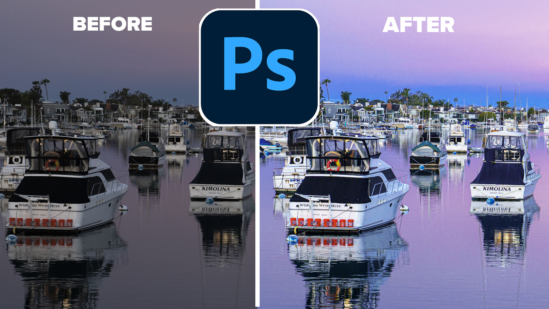
Here is the image before adjustments

And here is is after only applying the 3 tools (and a lowering of saturation on the dehaze).

This tutorial was to demonstrate Texture, Clarity and dehaze, You would use other tools on your image as well of course. “What about contrast?” you may ask. That is covered in it’s own tutorial here. Contrast | and Shadow/Highlight vs Black/White
If you found this tutorial interesting, then maybe you are ready for my comprehensive course on Lightroom Classic or Camera Raw. I also recently released a tutorial on Masks in Lightroom and Camera RAW here.
See newest Lightroom content
- Landscape masks in ACR and Lightroom
- Where are the missing tools in Camera RAW?
- Adaptive Profiles in Lightroom and ACR, 1 click pop on all your photos
- Miraculous reflections removal from photos in Lightroom and Camera RAW
Thanks for checking this out
Colin
PS Don’t forget to follow us on Social Media for more tips.. (I've been posting some fun Instagram and Facebook Stories lately)
You can get my free Layer Blending modes ebook along with dozens of exclusive Photoshop Goodies here
30 thoughts on “Texture, Clarity and Dehaze in Lightroom + ACR explained. The Ultimate Comparision”
Leave a Reply
How to make a photo look better in new Camera Raw 13.3 Photoshop 2020.
In this Photoshop Tutorial, learn how to design a magazine layout. Convert a layout into a reusable template in Photoshop...
Crop marks show the printer where to trim the final piece. Photoshop doesn't have the ability to create crop marks...


Most informative! Thank you. I’ve been using Photoshop for decades and Lightroom since it was released. There is always something new to learn.
This was a GREAT tutorial. THANKS Colin.
Hello
Great Information! My question is, if you get color outlines around things in your landscape image after applying the techniques you illustrated, how do you get rid of the color halos and lines? I do understand the cut-back saturation approach, but what if you like the image and changing settings changes your effect? Is there a more global way instead of your example of cutting back the saturation?
Thank You,
Marge
Sometimes you get chromatic aberration, you can fix those under the lens and color fringe
Most informative, thank you.
Nice explanation of the use of the 3 sliders. Rarely do I go over 20 on any of the sliders. What I found interesting was the reduction of vibrance/saturation.
I agree, you don’t want to get aggressive with those sliders
Thanks Colin. Been following for years.Your knowledge and sense of humour add to these lessons.Thank you
thanks
Thank you so much, very informative. Love your tutorials.
Hi Colin,
This is a fantastic tutorial. I finally get what these sliders do and for some reason using a mask to separate them never occurred to me. Your explanation of frequency was also very, very helpful!!! Please continue this tutorials. Love them!
Dennis
Thanks, happy you like them
What a valuable tutorial, thank you.
Glad to help
Your tutorials started out great and just keep getting better.
Thanks Ralph!
Excellent description of the tools. Thank you.
I get that texture, clarity, and dehaze are high, medium, and low frequency adjustments to image sharpness and/or contrast. Is it fair to say that the sharpening slider falls somewhere between texture and clarity, and that contrast falls somewhere between clarity and dehaze, or are they doing something different altogether?
Texture falls between sharpening and clarity. Sharpening is high frequency and works on finer details than texture.
Contrast is a combination of black and white. See my recent tutorial on contrast
Switching to camera raw and finding the effects panel doesn’t work in Photoshoot CS4 Extended.
Only clarity is in CS4, the other 2 weren’t invented when out came out.
great video!! can you share your test pattern ?
Thanks Colin. Your explanation of clarity, texture & dehaze will add another dimension to my editing. I especially like the hints of adjusting saturation & vibrance. When I’ve used dehaze, I’ve never liked the darkness/color change. Now I can use it.
Glad to help
Loved this tutorial. Thank you for sharing.
How do I turn dry ground to wet ground so I can use a rain brush or filter in Photoshop
Look at wet ground and what do you see? Usually darker, reflections and some highlights.
Excellent summary. This question has been bugging me for some time! Thanks
Well explained, simple and concise. I especially appreciate how you used each tool in specific parts of the image. Enjoy all of your tutorials. Thanks so much
Like others I learned how frequency relates to the use of the 3 sliders. I have used them for the photo as a whole and in masks but now I better understand why I get the results I get and can be more focussed on where to use them. Thanks as always.