Photoshop contrast alternative makes every photo better
Try this next time you edit a photo
So many people increase Contrast to add pop to a photo, but they aren’t aware that they can also be damaging other tones in the image. Here is another way of adding some punch, while preserving the details in and image and increasing its quality.
After editing thousands of photos, I found myself naturally gravitating to these adjustments and I want to share my findings with you.
Here is the starting photo. Note: I have made some initial adjustments to shadow and highlight and exposure.

Do you ever use the contrast adjustment in Camera RAW or Lightroom? Most people use this the opposite to what produces the best results.
In Photoshop Choose Filter>Camera RAW Filter (It’s the same in Lightroom too)

Most people increase the contrast to add pop to the dark and light areas of the photo.
But look at how we are losing so much detail in the dark rocks and the water looks thick and dense.

Instead, reduce the contrast a little bit. Notice in the image below, the detail in the rocks and how much more natural the water looks.
We will bring back the darks and lights, but in a different way.

One of the things I have noticed is that contrast is very similar to moving both the black and whites.
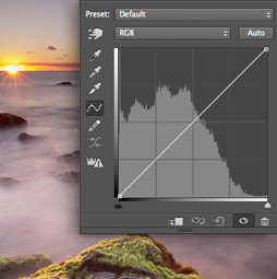
Examine the histograms
Look at the charts and notice the histograms are very similar (not exact, but similar results). Contrast also affects the midtones, but to a lesser degree..
Reducing contrast, compresses the histogram towards the middle (preserves highlight and shadow detail). Minimum settings on Black and white sliders do the same thing.
Inversely, when you increase the contrast. you stretch or expand the histogram and clips or loses details in the extremities. Pushing Blacks and whites does the same thing.
This is important because, rather than increasing the contrast, we can reduce it and bring back the dark and light contrast using blacks and whites and thus get separate and more control over the tones.

In the image with the reduced contrast, move the blacks to the left to bring back the body to the darks and slightly increase the whites to brighten the brightest parts of the image.
This adds the pop without zapping the details and making the image look crunchy.

Here is the original image

With contrast added

Reducing the contrast, but adding pop with black and whites. More details and lighter looking foam (as in weight and density, not just tone)

Look at the foreground foam, See how contrast separated the foam and water and looks dirty

With the reduced contrast, the water and rocks look more natural.

Obviously this isn’t the only adjustment I make to a photo. But I wanted to share a different way of using contrast, that in my opinion produces better results. Check out the 2 minute video at the top to see a bit more.
This is the way I have been using contrast myself for a while now.
I hope you found this useful.
Great to see you at the CAFE
Colin
PS Don’t forget to follow us on Social Media for more tips.. (I've been posting some fun Instagram and Facebook Stories lately)
You can get my free Layer Blending modes ebook along with dozens of exclusive Photoshop Goodies here

24 thoughts on “Photoshop contrast alternative makes every photo better”
Leave a Reply

How to blend text realistically into a photo, free Photoshop tutorial, includes blending, shaping, distressing and adding 3D depth to...

How to choose the best Generative ai model in Photoshop. Firefly, Flux and Nano banana, which is best? The answer...
How to stack presets in Lightroom and Camera RAW There is something really important to understand about creating presets that...


Good and useful tip!
How is the look of this different than using Clarity instead of Contrast? Thanks!
TBH, I don’t like to use clarity, it makes the image too “dirty” for my liking. If I do use clarity, its a very tiny amount.
Hey Colin,
Never thought about that way of doing it. Thanks!
Dennis
As part of my workflow, I adjust the black/white sliders until I see the histogram reach the limits where the white indicators light up. Then I make all my other adjustments for texture/clarity/dehaze. If I am looking for pop, I use levels for white/black with the eye dropper and dial back from there.
Good examples! When I learned how to process photos in my photography club, one of the instructors (a fellow member of the club) told us to be careful of using contrast. The instructor suggested using whites, blacks, shadows, highlights, texture, clarity – all with a light touch. And… to pay attention to the histogram.
My previous method was to reduce the highlights, usually to its minimum value, then adjust the shadows, whites, and blacks to get the balance I want. I did a comparison on a photo of people and found a much softer and pleasing interpretation using the reduce contrast method of this video. Your comments would be useful.
Been using the black & White sliders and not the contrast slider for some time now, however I will try tweaking the contrast down in future. Thanks for another great tutorial.
I’ve never thought to reduce contrast in connection with changing the blacks and whites. I’ll give it a try. Thanks for another “out of the box” idea.
Thanks for the suggestion Colin.
I have used the black/white sliders before but it hasn’t occurred to me to reduce the contrast slider first.
How do you think this compares to using curves
You could absolutely do the same thing with curves
I take a different approach I like better. After using Auto, with a contrasty scene I lower contrast, which pushed tones toward the middle, then I add Clarity (or sometimes Dehaze) to get contrast in the midtones. This has the benefit of adding more detail across the whole tonal scale. You do great tutorials, Colin. I’ll keep coming back for them.
Hi Colin: for probably the first time your hint is not new to me. Regardless, it is nice to know that I can do something right on my own. Keep up the good work. Many thanks.
Ha ha, nice one
Thanks Colin, very easy, usable and elegantly simple.
Thanks for this elegant, concise work-around. Always a pleasure to be part of the Cafe!
And it’s a pleasure to have you here Barry
Always good to learn new ways of doing things – tried the technique on some of my seascapes – what a difference! Thank you 😊
Glad it worked for you
Thanks Colin, a new way to do it
Thank you. Recently read of another similar? processing method i.e. reduce the contrast as you say and increase the clarity (instead of increasing contrast)
I’m not a fun of clarity. Since Texture came out, I almost never use it now. But each to their own.
Excellent tip. Thanks so much for the video
Great video. Many tutorials show what a slider does. You explain how to make use of an elegant application of this. As with many of your tutorials, I find the café a nice place to come back to and understand a few things more.