Blending layers in Photoshop, Double Exposure Tutorial
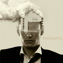
I’ve recently noticed that the double exposure effect is blowing up on the internet. This isn’t something new, in fact the effect has been around since the days of film. If you exposed a frame and then didn’t advance the film and shot a second photo, you would get what was called a double exposure. Two photos on one frame. Many digital camera allow you to simulate this effect in camera.
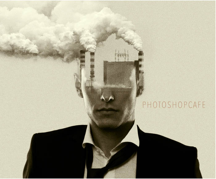
The final Double Exposure effect you will create in Photoshop
We have also seen this for ages in Photoshop when you blend 2 photos together in screen or lighten blending mode. This simulates 2 projectors overlapping each other. Of course, there is a good chance you don’t care about this history and just want to make the effect.
This effect has recently become very popular due to the intro to the hit TV show, True Detective. On the intro its done with video, but it has spawned a resurgence of double exposure art. (Once again, it’s far from new, just suddenly popular). I’ve seen a number of tutorial on this topic, some good and some, not so good. Here is my method to create this effect. I have used the actual art from True Detective as inspiration and we will closely recreate it with different images, but the same style.
Watch Video Tutorial here
I have used 2 images from Adobe Stock and have included the links to the original images. You can use you own images or the watermarked versions to follow along.
(Here is a tutorial on using Adobe Stock in Photoshop CC)
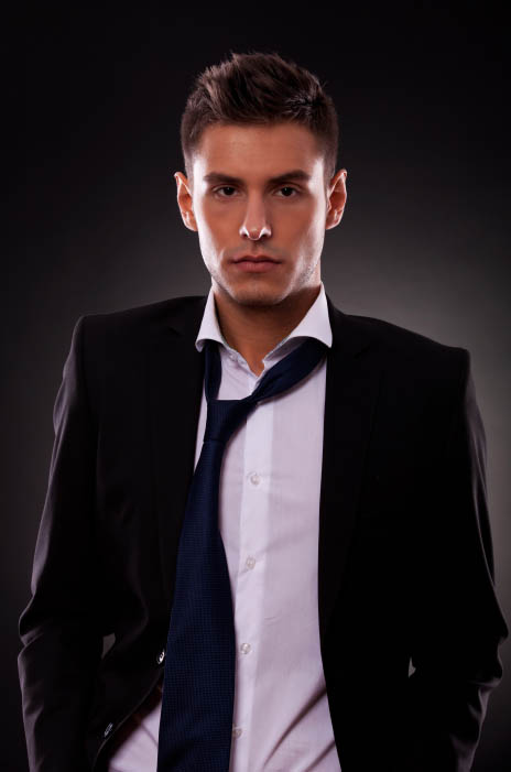
Man with tie | Industrial picture of powerplant
I started with 2 photographs. I needed a headshot with a suit jacket, loose tie and strong chin to match the True Detective style.
The second Photograph, I needed something industrial, with tall vertical structures, so I chose this factory image. I also knew I could have fun with the smoke.
Step 1
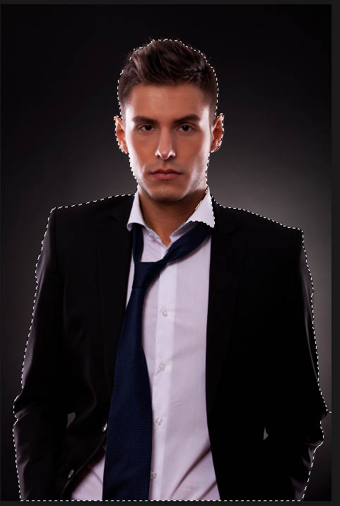
First thing, is to separate the man from the background. Grab the quick selection brush. ![]() I also have a tutorial here on using the refine edge tool in more depth if you get stuck
I also have a tutorial here on using the refine edge tool in more depth if you get stuck
Make a selection around the man, use the alt/Option key to deselect areas if you go over.
Step 2
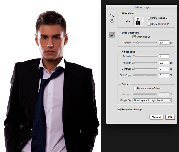
Click on the refine edge option at the top of the screen
Add smart radius and increase the edge Radius to around 2-4 px
I added 4 for smooth (this is optional)
Run the refine selection brush through the edge of the hair to get a cleaner selection
For output, make sure New Layer with Layer Mask is chosen
Click ok
Step 3
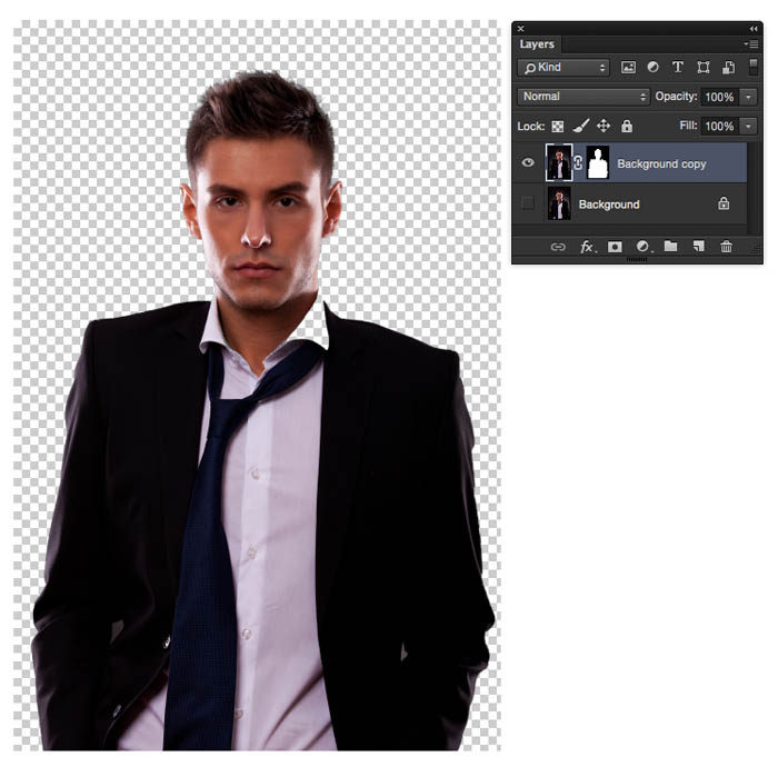
You should see the man cut out on his own layer with a layer mask as shown. If not, return to step 2 and see what you missed.
Step 4
Combine the 2 images into one document… (here is how)
Open the tab for image 2.
Click-drag the image into the tab for the image that contains the man, the image will open
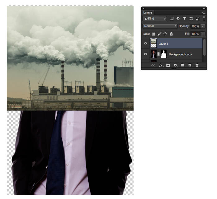
Without releasing, drag the image into the middle of the man image and release. It should be on a new layer as shown.
The end result should look like this
Time to combine the photos into 1
Step 5
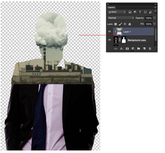
Move your cursor to the separating line between the 2 layers
Hold down the alt/option key and you will see a square arrow on the curser, click to “clip” the layer to the shape of the cutout beneath.
Step 6: Cropping
For the art that we are creating, we only need the top of the shoulders visible. Let’s crop this down to size. Choose the crop tool.
Drag out the cropping area
Make sure that “delete Cropped Pixels” is unselected at the top. This will preserve the pixel and allow us to reposition things later.
Press Enter to apply the crop
Step 7: Colorizing the photo
Right now we have a lot of color in the photo. This isn’t how the final result should look. No need to convert to black and white, I have a better method for you here.
Choose a new foreground color similar to what I have here. #e2d6b2. You can choose your own color or change this later.
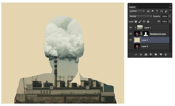
Create a new layer underneath our 2 layers and fill with out foreground color (Alt/Option+Backspace)
We now have a background rather than transparency.
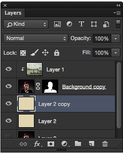
Duplicate the Layer by pressing Cmd/Ctrl+J
Drag the duplicate color layer to the top of the layer stack.
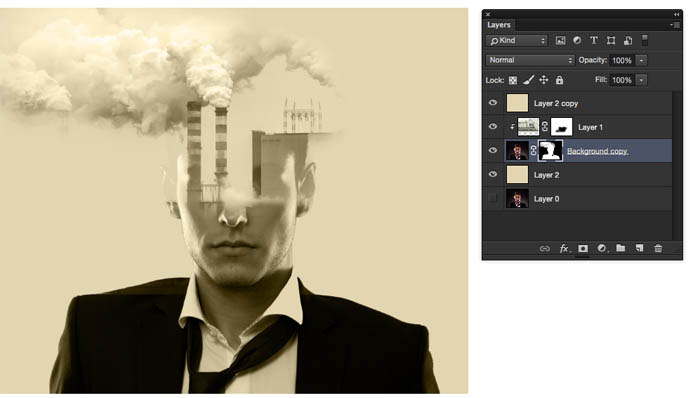
Right now, you will see a solid color.
Change the blending mode to Color and now everything will take on this new color while preserving the luminosity.
Step 8: Blending and Masking the Layers
This is where we get into the good stuff.
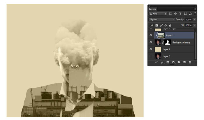
Choose the Industrial image layer (layer 1). Change the blending mode to Lighten. (Extra info for nerds: This simulates 2 projectors pointing at the same screen. One with the top image, and the second with the layer underneath)
You will start to see this cool blending effect.
This is the actual double exposure, like you would see in camera. If this is all you wanted, you can stop here.
Read on for the rest of the True Detective Look…
Step 9:
Because the top layer (layer 1) is a clipping group, we can drag it around and reposition it and it will stay within the boundaries of the face cutout. I dragged it over so that the smoke stacks are showing on the left.
Notice that the silhouette of the head is still showing on the right? Let’s fix that.
Step 10
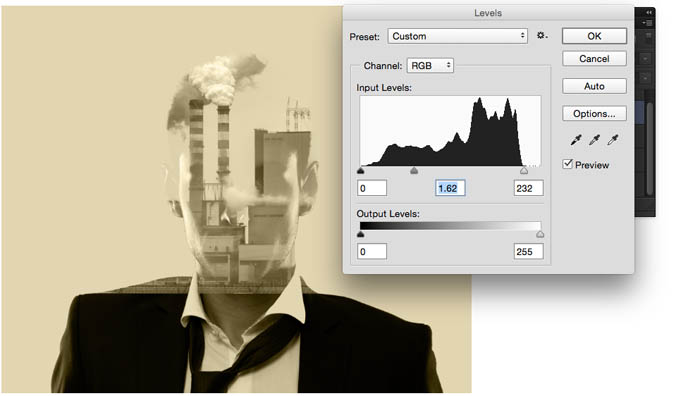
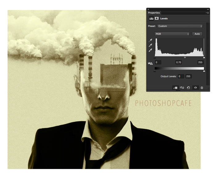
Choose Cmd/Ctrl+L for levels.
Slide the white slider over to make the shadow area disappear. You may also need to move the mid tone slider over a bit like I did here.
The goal is to make the overlapping areas invisible, it will take a little tweaking with the levels to get it exact. This is part of the magic of blending modes.
Step 11: Masking the effect
Now that we have matched the layers, we can bring back part of the bottom of the face and also smoothly blend it into the shape on top.
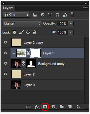
(With Layer 1 still the active layer) Click on the Add a layer mask button at the bottom of the layers Panel.
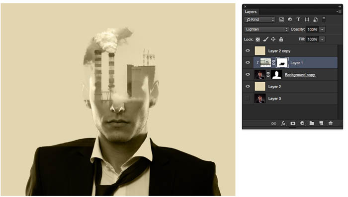
Choose a soft edge black brush and paint on the image to mask out layer 1 and reveal the bottom of the face. When you paint on this mask, you will hide the factory and allow the face to show through. Paint with White to hide the face and show the factory.
If you want to go outside the boundaries of the face and expand the factory to show out of bounds, do this.
You will see that we have a layer mask on the head (from the refine edge earlier). If you choose that mask and paint with white on the image, you can paint out of bounds and show the factory.
Paint with white to allow the smoke to show. Paint with Black to hide the smoke or clean up areas where you went too far.
Step 12 Scaling the effect
So far, it’s looking good, but Not quite fitting. Lets scale the top image to make it fit better.
Choose the factory layer (not the mask)
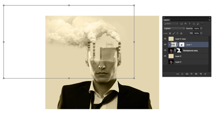
Press Cmd/Ctrl+T for free transform
Shift and drag on the corner to scale up or down proportionately.
Scale it down so that the stacks match both sides of the head. You can move the layer by click dragging on the inside of the rectangular selection area.
When you are satisfied, press the enter key to apply the effect.
Paint inside the masks, to clean up and refine the look that you are going for. We are mainly finished with the overall effect. Now I want to replicate the vintage film grain look with the colors a little bit.
Step 13 Adding a color tint to the shadows
I noticed when looking at the original art, there is a red tint in the shadows.
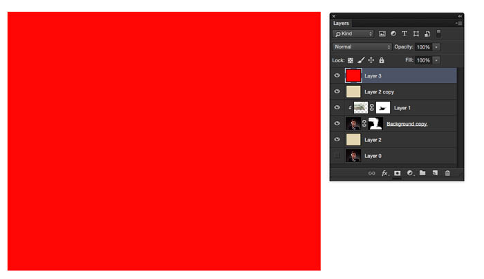
Create a new layer and fill it with red
Change the blending mode to color.
Almost there
With the red layer active, click the “fx” button at the bottom of the layers panel to open the layerstyle menu
At the very top, you will see “blending Options” choose it.
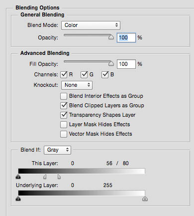
We are now in Advanced Blending mode. See the Blend If sliders at the bottom?
Drag the white slider to the left to hide the layer contents in the highlights. To get this to work, you will need to split the triangle slider.
Hold down Alt/Option and drag out one side of the triangle to split it.
Play around with the sliders until the red is showing mainly in the shadows as seen here.
Reduce the opacity to suit your tastes, here we are at 56%.
Step 14: adding film grain
Let’s add some grain to simulate the film look.
Create a new layer, but wait! Hold down the Alt/Option key as you click the new Layer icon. This will bring up the New Layer options.
Choose Overlay from the mode
A box will appear that says “Fill with Overlay-neutral color (50% gray)” Turn on that option
Click ok
You wont see anything, but the new layer will now be filled with 50% gray and be in Overlay blending mode. Perfect for us to add grain to (You can’t apply grain to an empty layer, which is why we went through this step).
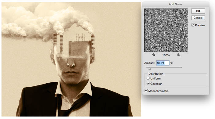
Choose>Filter>Noise>Add noise
Choose Gaussian and Monochromatic
I added 37% (approx) This will depend on the resolution of your final image, to get the exact look that you want.
Click ok to apply the grain. You can change the opacity it the effect is too strong for your image.
Step 15 Finishing touches
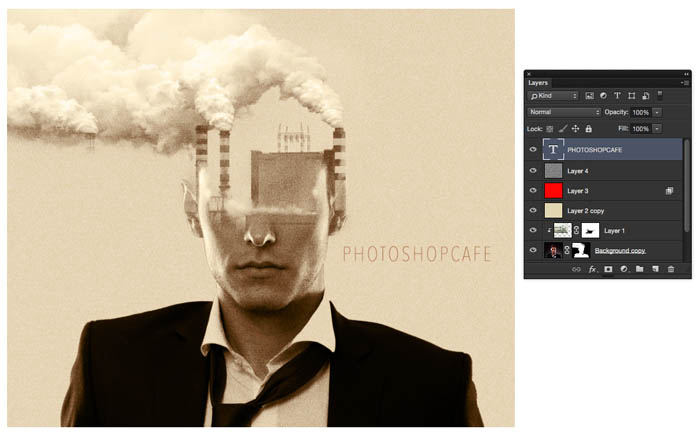
I added a little bit of type here to match the feel of the show opening credits.
(Font is Avenir Next Condensed – Ulta Light)
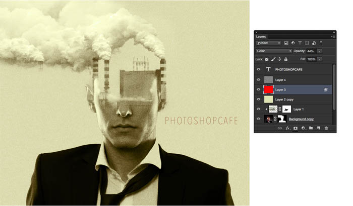
I wanted to make the color a little less red, so I reduced the opacity of the red layer.
The final look should have more contrast.
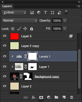
Create a Levels adjustment layer directly above the 2 image layers. We want to affect these only and not the background color.
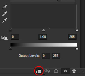
Clip the Level adjustment to the image layer by turning on the “Clip” icon in the Layers panel as shown here.
It should look like this in the stack.
Adjust the middle slider in the Levels to get the contrast in the midtones to complete this part of the look. It makes it a bit more gritty looking.
Optional: To make a lighter version of the overall color
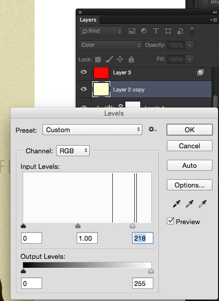
Finally, to lighten the overall color a bit. Select the Colored layer and Press Cmd+L to open levels. Slide the highlights to the left a little bit.
And the Final result.
I know this was a lot! A really in-depth tutorial that covered a number of techniques that you can use to stylize your images.
If you like this, please share on social media (Button at the top) add a comment and share with your friends. The more support we get, the more tutorials I can write and record!
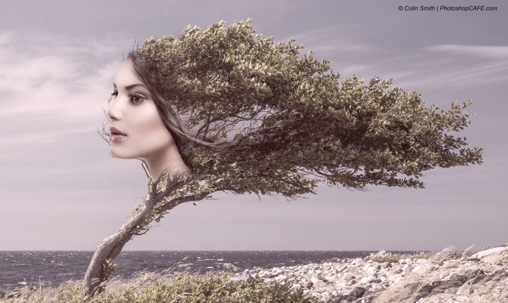
Here ia a different image I created using the same techniques, this one is a bit softer themed.
Thanks for checking out this tutorial. Add a comment and let me know what else you would like to learn!
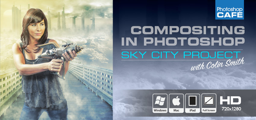
If you are interested in learning more about compositing in Photoshop, I created a very comprehensive tutorial called Sky City Project. In this series of videos, I show multiple ways of extracting photos, blending them and then changing the lighting with blending modes and dodging and burning. As a bonus I show you how to paint in clouds (like the smoke in the catzilla image) and well as some different ways of creating cinematic coloring effects.
See you at the CAFE!
Colin Smith
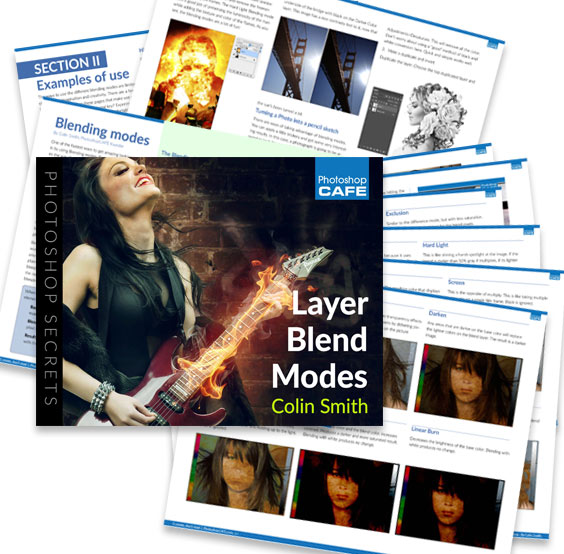
Layer Blending Modes. Free eBook by Colin Smith
Don’t forget to check out the website as we add new content every week. You can also find us on social media: Youtube, Facebook, Twitter, Pintrest and Instagram @PhotoshopCAFE.
See you at the CAFE!
Colin
PS Don’t forget to follow us on Social Media for more tips.. (I've been posting some fun Instagram and Facebook Stories lately)
You can get my free Layer Blending modes ebook along with dozens of exclusive Photoshop Goodies here
23 thoughts on “Blending layers in Photoshop, Double Exposure Tutorial”
Leave a Reply
How to create realistic looking water reflections in Photoshop. This free Photoshop tutorial shows a quick way to add a...
How to make a shattered glass effect in Photoshop with displacement maps and Layer Blending modes.
How to create a magical beam of light on a landscape photo in Photoshop and add pollen dust.











step11, brush thing ain’t workin bruh
Why… Could you please check it again… “Choose a soft edge black brush and paint on the image to mask out layer 1 and reveal the bottom of the face. When you paint on this mask, you will hide the factory and allow the face to show through. Paint with White to hide the face and show the factory.” I didn’t find any issue there!
its most informative tutorial. its helps me on my design.
Good info. Now I know how to double exposure my pictures. Thanks!
Informative tutorial and the tutorial provide more concept about creating double exposure effect like true detective TV show . So i said that, this tutorial is very useful .
Tremendous lesson in so many areas! Thanks for all the extra tips!
Su
Excellent article ! For my two cents if people need a CA CDPH 283 B , my business partner filled a blank form here
https://goo.gl/rh55izCool tutorial! Thanks for sharing 🙂
Wow! that was hot. Always wonder how they did that. It inspires that surrealist mode in me. Thanks for another great tutorial
its most informative tutorial. its helps me on my design.
Thanks really nice design
Awesome creativity skills. Congrats!
Excellent this posting.
This was really helpful. Thanks for this tips!
Great tips! Thx! 🙂
Thanks for sharing this very helpful tutorial.
Wow, a very simple and easy tutorial to follow. In my opinion it’s better to have pictures and screenshots that show you step by step what to do. I will definitely try to experiment with these steps and to create my own ideas.
This was really helpful. Thanks for this tips!
Thank you for these great tips!
Great tips:) Thank you for sharing your creative idea.
Great tutorial but I found with PS22 it was tricky to follow and I got lost a few times.
But that’s progress
In my opinion, it’s better to have pictures and screenshots that show you step-by-step what to do. If you use images there are some benefits for those who are not professionals in any field like clipping path service. These will be helpful for All.
Great photoshop tips. Thanks for sharing.