When Photoshop changes your colors, Color Spaces explained
Have you ever gone to print or export a photo in Photoshop and the colors look completely different? This quick tutorial shows you how to change your settings so it never happens again. I have gotten asked this question so many Tims over the years, I thought I should address it with this short video.
I hope you found this useful
Thanks for checking it out.
Colin

Keep growing with Premium Courses
Photoshop 2026 for Digital Photographers
Learn Photoshop properly, from the basics to pro retouching, step by step.
$129.00 · one-time purchase · instant download
Free for you
The Photoshop Vault
Get my free Layer Blending Modes ebook along with dozens of exclusive Photoshop goodies: actions, brushes, presets and cheat sheets.
You're on the list, so your free goodies are waiting for you in the Vault.
Get Free Photoshop Goodies Open the Vault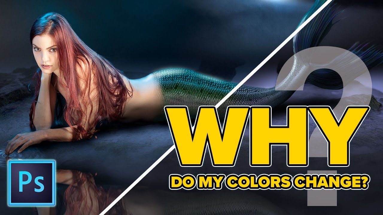
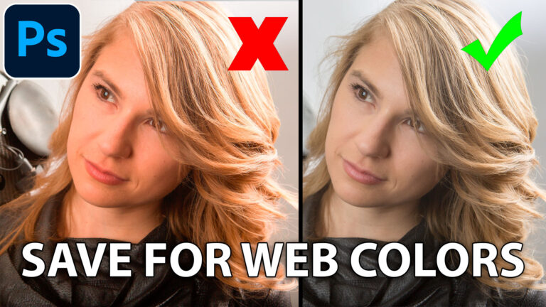
Basic Color Management in Photoshop for beginners
How to color manage Photoshop for beginners, so that your colors don't change when you output your images Read tutorial
Hidden button to instantly fix color of photo in photoshop
Hidden button to instantly fix color of photo in photoshop I’m going to show you a button that most people don’t even... Read tutorial
Curves in Photoshop explained Photoshop Tutorial
Here is a beginner to intermediate tutorial on how to use curves in Photoshop. Curves are feared by many, but they don't... Read tutorial
How to use Curves in Photoshop for tone and color tutorial
How to use Curves in Photoshop, How Photoshop curves work and how to adjust color and brightness on photographs. Using Photoshops most... Read tutorial
How to change the color of anything in Photoshop including white or black
How to change the color of anything in Photoshop instantly, including white or black. Read tutorial








Yes…this is a problem for me when I get prints. BUT somehow I missed some basic that….what and how does the image of the plane have to do with the mermaid?? I get some of the settings but am missing WHY this involves the plane image????
So darn helpful. Thanks to colin.
Good video, but would very much like to see one that goes into more depth, especially with respect to printing photos
Thank you so much Jason, for clarifying that color-shift problem. Please kindly do produce another tutorial explaining when we want to choose Export for Web, Color Settings …, Assign Profile …, or Convert to Profile …, and the options in each dialogue box.
Thanks (Not sure who Jason is though ;))
I photograph and square up and resize photos of my wife’s paintings for both print and web use. She is constantly complaining that the color is wrong and has even started using Kinko’s instead our office Epson printer to print out pictures for submissions. She uses a LG television screen to view the digital stuff and it is different from what I see on my ASUS desktop monitor set to sRGB. I check white balance and use a gray card when taking the photos and I calibrated my monitor with a Spyder 4 pro, but there has been no improvement in this issue.
great tutorial. really helps to understand how to configure proper colors for printing
Love Your tutorials!! They are so helpful!! Would love more on color management and printing!
Color management is something I have been having problems with so this came at the perfect time
Thank you for this very interesting video. I do have problem with colour management and an in depth video would be very useful to me.
I appreciate your time and effort to help people like me. I convert my paintings into books and book covers and of course, I struggle with keeping my colours consistent. I used to use Photoshop full version. That old Mac with a large monitor and printer are now obsolete. Now I am reduced to a Mac Air and a new Epson printer. My photoshop is reduced to Adobe Photoshop Elements Editor because that’s all I can afford for now. A lot of your info is not usable now but I am also a videographer, so I keep up out of interest to your videos. Thanks.
Hi Colin, very informative, enjoyed the video as I am not very knowledgable with photoshop, but enjoy using it. If I might ask you a question regarding CS6, when I go to print a new image, the epson driver always goes to – Printer manages colors. Is there any way I can permanently set this to Photoshop manages colors? If I have already printed this image previously, it does remember – photoshop manages colors. Don’t know if you need it, but the printer is epson XP960
Hope you can help as it would save some time when I am printing lots of new images.
Thanking you,
Regdel
not sure if you can change it permanently
great one, Colin, Thank you! By the way, the ATX meeting on September 15, will be all about color calibrating your monitor with the XRite tools…! The meeting is from 9 am to noon at the Lakewood Masonic lodge.
This has been an on-going issue for me and i would like to see more about this complex subject.
Yes, Thanks a lot. Helpful. A session on color profiles would be great…
Thanks for this tutorial!
My issue sometimes is when I’m exporting a jpeg on my desktop. I always experience a colour shift. This is not the case when exporting from Lightroom. Lightroom always produces better result. Wonder why .
Great video. The changes in colours I find when send via email or posting to web are subtle changes. Darkening and increased saturation. My screen is calibrated. I end up trying to over compensate with the original to produce a better sent/posted image.
Is it possible to do another video post on this topic. I know a lot of photographers struggle. Likewise when we view other peoples’ Images we don’t have their original so we assume the problems we are experiencing are just ours alone.
Thanks. Great videos for me. Cheers Nigel
Hi Colin, Thank you for your tutorial. I’ve done some work on colour space over the years. What I don’t understand is how a high order colour space (like ProPhotoRGB) works visually to our eyes when almost all computer screens are sRGB? Why does choosing different colour spaces have any effect when our screens are only sRGB?
I hope I’m making myself clear because I’m confused myself in trying to explain it. There’s something I’m not getting here and perhaps you may be able to put me straight?
not all screens are sRGB
Thank you so much! It happens to me all the time!!!
I found this short tutorial to be very useful and a tutorial about color management would be very helpful to me. It would be especially helpful now because in the past I was “up” on color management but it has been a long time since I really paid attention to it and I’d like to get the latest information about the process and the most current, best tools (hardware & software). Thanks!
Useful but too fast for me. It would help if you blew up the heading you are going to and the headings you are checking. A lot of time you say something like “: go to “edit” and select —. then quickly go on before I can take in where you went. Even more important when you are going some place on a page that I am unfamiliar with. Thanks for your work.
I have had trouble getting the right color match when printing at a pro lab. I had my monitor calibrated but the colors were slightly off. Maybe this video will help
Ill try and remember that, until then, the pause button is your friend 🙂
Super useful. I’d welcome more on the topic. It’s hard to wrap my head around the whole topic of color profiles!
Thank You very much, is interesting and educational.
Years ago I almost threw out my version of Lightroom because of color profile problems. Even though this was a PS tutorial it still would have saved me weeks of hassles. Thanks for the info. Right now I’m having troubles getting my photos edited in LR classic to match my images printed at a local pro lab (it does supply ICC profiles for their printers). Maybe a tutorial on that topic for LR and PS?!?
Great info! I’d also welcome more indepth tutorial on color space.
Thank you–i want to look into this some more too. VERY HELPFUL
thank you! Please make a tutorial for color management for print please.
Thank you! I always enjoy your tutorials.
I’m having troble with color and lightness when I use the flatten image command and I see that even if
I merge down the layer one by one, sometimes the result is not the same of the multi layer image. Why?
Yes, I would like to get your take on color management for the web and printing.
Thanks for your great tutorials. I suspect that anyone who ISN’T having color fidelity issues is just not paying attention… or simply doesn’t care! I’d appreciate all the help you can give on this topic. It has been problematic since the early days of desktops and home printers, as well as when sending to professional printing services.
A lot of my pics print red as dominant color and usually more red than it actually is. Has this also got to do with the Color profile. Quite annoying as I have to go back and start re editing and desaturating my images.
This tutorial came at just the right moment. I asked myself why the vibrant colored birthday card I created printed out at a professional copy place, no longer looked bright and sharp. I hope this tutorial will answer this cunumbrum.
Your tutorials are always very clear and paced well for notating them. Thanks Colin, Lisa Grooss
Thanks Colin for this tutorial. My vibrant birthday card creations never look so after printing out at a professional copy place. Perhaps this will be helpful. It is a digital printing shop.
Love your tutorials. They are always clear and the pace with which you present them is slow enough for me to follow while taking notes.
Hi, great tutorial. As I have still some variations I have questions regards workflow.
I am using a color checker but wondering how to set up my camera raw setting while opening a cr2 file in photoshop.
– Do I use my color profile I created based on my measurements?
– if not, what else?
Hi, thanks for that. As I still have some issues I was wondering what exactly is the workflow to work with a calibrated profile? After loading a photo into camera raw, do I choose my color space I measured? Default is Adobe RGB. Thank you
Thank you so much for this info, it’s really a great help! God bless you
yes, very helpful