There are a few little tricks you can do in Adobe Photoshop to make your text look a bit sharper on your Web pages, especially at smaller sizes.
When resampling blocks of text, there is an option you may not have noticed that will help you achieve sharper results. This is particularly useful when you have scanned in blocks of text or line art
When we go to resize the image (Image> Image Size), Bicubic resampling is the default option. This works best for most images.
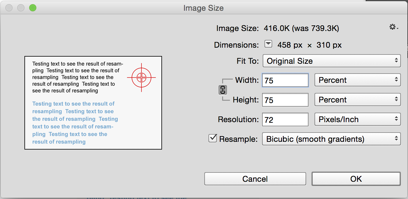
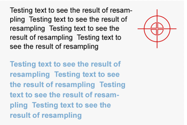
Here is the result of Bicubic resampling on our text
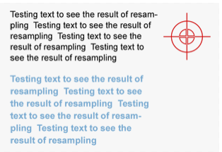
Try it again, but this time choose Bilinear (Or try Bicubic sharper) resampling
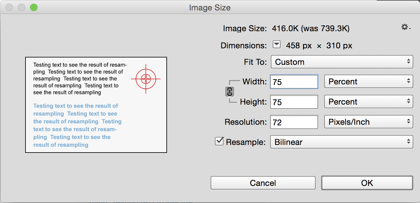
Notice how much sharper the text is?
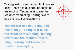
Here they are again, side by side, so you can compare them better.
The second trick you can use in Photoshop applies to small text and its tracking, or kerning, which is the spacing between letters. Here is a line of text with standard tracking
![]()
![]()
In the tracking box (Window> Show Character), increase the amount to 20

![]()
See how much more legible the text is? Look at a road sign and notice that the tracking is set very wide. That’s why you can read them from a distance.
Many people use anti-aliasing on text on the Web, with mixed results. Here is a line of text with the crisp anti-aliasing applied (Layer>Type>Anti-Alias Crisp). It’s kind of blurry
![]()
![]()
Here is a line with sharp anti-aliasing applied Notice the difference?
![]()
![]()
These little tips help you to produce Web pages with sharper, easier-to-read text.

This site uses Akismet to reduce spam. Learn how your comment data is processed.
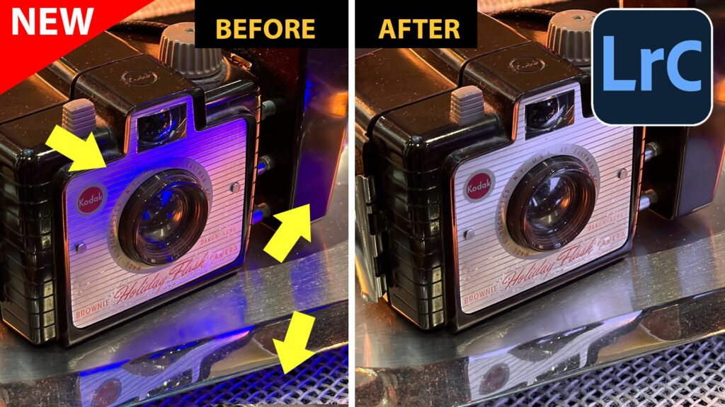
How to remove colored reflections in a photo with Point Color in Lightroom Classic and Adobe Camera RAW...

DJI Mavic 2 Pro review and camera test. Pros and cons, compared to Mavic, Mavic Air and Phantom 4 Pro....
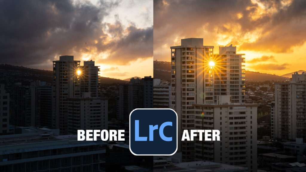
How to edit a photo in Lightroom. The quick way to get spectacular results in Lightroom Classic. ...


Very important things you describe.
hello, could you please tell me the font in this image? i’ve been looking everywhere for what that font is, as i’ve seen it before on this creative writing website i use. could you please tell me? it would only be for personal use with images among friends, no business or article publishing. https://photoshopcafe.com/wp-content/uploads/2014/10/091002_fg10.jpg
thank you so much ! also thank you for these amazing tips. they’ve been more than helpful.
I forget but probably arial
Hello and thank you for the tips!
It is unclear which of the fields shown in the image is to be increased to the value 20. One field that I think is for the kerning has the value 50. Do you mean one should *decrease* that value to 20? Please clarify!