PhotoshopCAFE Design Challenge 8 Video Game Cover

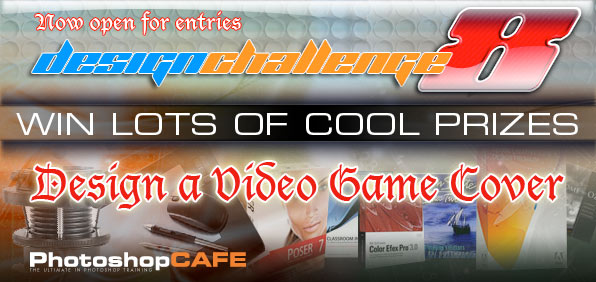
DESIGN A VIDEO GAME COVER!
Make a cover for a video game. The twist? You have to use a tool from Photoshop as the title of the game.Props for wit and cunning! Use any original artwork you desire. You may use any tools or platform you choose, but you must use Photoshop for at least 50% of the Image editing/design.
Winners and Finalists
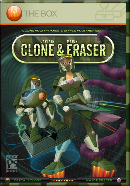
First place :: RandyToons
Colin: The clone and eraser weapons are very well done. Looks like a fun game to play.
Oliver: Very very very nice. Is that all selfdrawn?
Avi: I love this and want to play it. I love, love, love the clone glider and the trails it leaves. Brilliant touches.
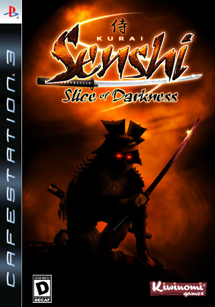
2nd Place :: dcloud
Colin: Very eye catching. The type treatment works really well with a good clean design.
Oliver: Nice ambience and use of light. Overall creation meets the theme and looks very convincing.
Avi: Stunning and dark visuals, with an attractiveness that draws me in. This *is* a game box. I love the logo treatment too. Kiwinomi gets you extra points. 🙂
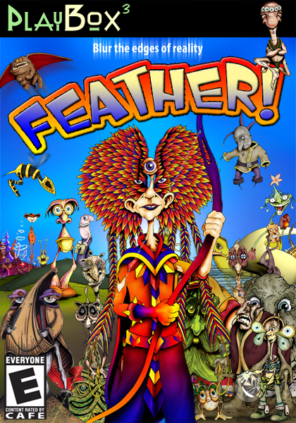
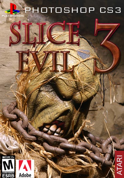
3rd Place :: GivenGraphics
Colin: Considering all the original characters, this is amazing. Composited well too.
Oliver: I hope there is a lot of self-made artwork in it as i really like it, 5 out of 5 i say.
Avi:Original, bizarre, grabbing, fun. I hope the game Spore has a cover this good.
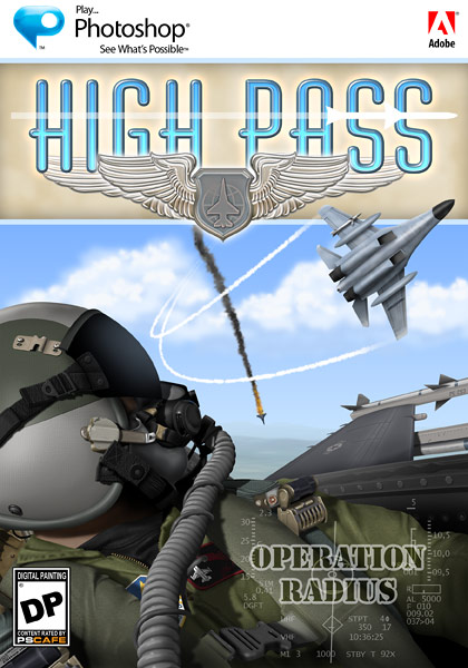
Honorable Mention :: PNeal
Colin: Looks like a nice Flight Simulator game. Really good illo skills here.
Oliver: The effect-quality is superb. The ideas and details too. Nice idea and nicely done. Congrats.
Avi: Another entry that could very well be a game box. I love the detail, composition and color scheme. So where can I buy a copy?
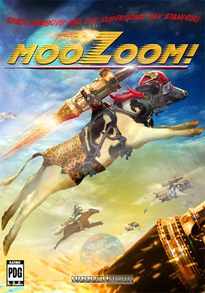
Finalist :: dogtrombone
Colin: Obviously a lot of time has gone into this. It’s a bit weird, but in a good way. Very original.
Oliver: I like the idea a lot, execution is very fine, seemless stuff!
Avi:I love the wackiness of a cow wearing leapord skin underwear and rocket belts. See, this is a game I would play. Really great work.
Finalist :: rpaz
Colin: I like the ink sketch feel to this. The Wacom pen is a nice touch.
Oliver: The type FX is nice but not original, the rest is just nothing for my eye. Overall Layout is bit cluttered. Maybe following just one or two ideas would have helped?
Avi: I like the roughness of the hand drawn elements… the feel is very much in line with a World of Warcraft type clone.
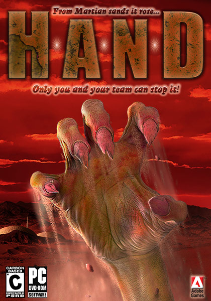
Finalist :: TCcreative
Colin: The quality of the texture on the hand is awesome.
Oliver: Type usage is unfortunately ruining it completely, the hand seems okay (nice motion-effect!)
Avi: This is phenomenal. Simple, incredibly detailed and it visually grabs you (couldn’t resist, sorry).
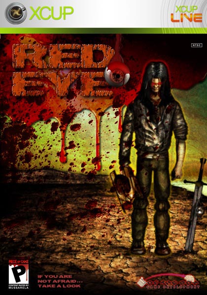
Finalist :: Mussarela
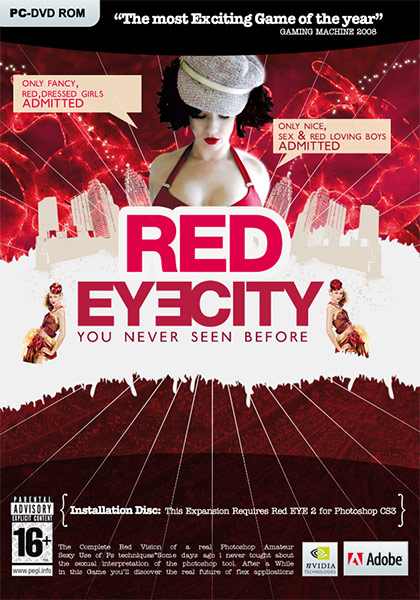
Colin: This just looks like a video game cover. All the pieces are pulled together really well.
Oliver: Kinda funny idea, nice execution. Overall ambience ist very nice.
Avi: A bit hard to see what’s going on here because there isn’t enough contrast between the background and character. Might have been more distinct had the blood behind the RED EYE not ran behind his profile.
Finalist :: jblack85
Colin: The quality of the rendering is first rate. Could have used tighter design elements though.
Oliver: akes up a convincing cover for a game but it doesn’t touch me too much.
Avi: Texture wise I find this well done, Composition wise I find this lacking. There is too much noncontrasting color that makes this scene hard to define without looking over it carefully. Title adds to the clutter
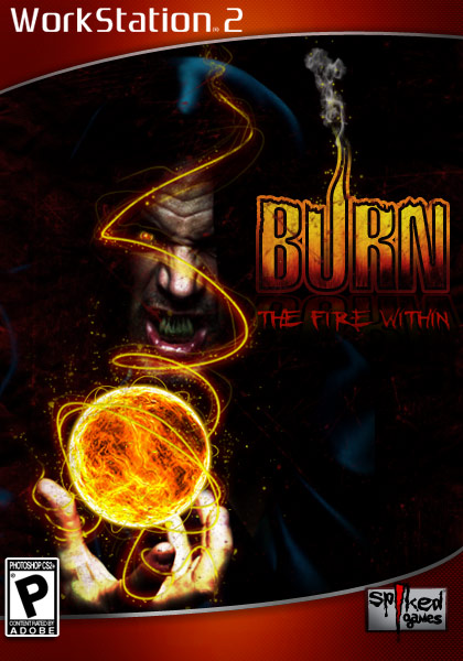
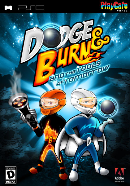
Finalist :: dewking
Colin: Nice feel to this and the fireball is awesome.
Oliver: Nicely done, all points. Nice little ideas and details.
Avi: I love the fireball effects (used paths?) I also like that you (presumably intentionally) kept a lot of white space (dark space in this image) to highlight the Burn tool’s effects in the actual Photoshop. Seeing a theme tie to the actual tool is great.
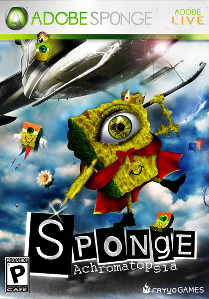
Finalist :: rAyVoLvEz
Colin: A lot going on in this, but it still looks clean. Good quality detail.
Oliver: Funny but is this meant to be a game cover? not sure.
Avi: I like this one quite a bit. Silly, engaging, good composition. Great type treatment.
Finalist :: Olie
Colin: Very eye catching. Nice center of focus.
Oliver: Very cute! Shading is not 100% perfect but we see talent.
Avi: Great cartoon work, not sure I get it as a game cover. The type treatment on the sub-title is a bit too compact to be readable. The bones behind his head are confusing (visually it’s hard to know if they are a part of his head or not).
Finalist :: dcloud
Colin: This is really nice. The characters are well done and the typography is perhaps the best in the contest.
Oliver: Nice idea, clean executed, like that.
Avi: Great as an idea, great as a game cover. I love typography and lighting schemes. I like the character ideas too. My only critique is the two heroes somehow seem less detailed than the background planet.
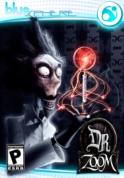
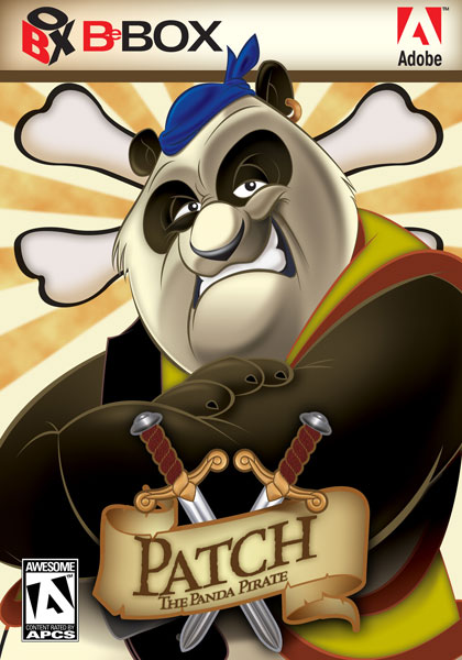
Finalist :: bigdealneal
Colin: I agree with Oliver. The type is nice on this. Interesting concept.
Oliver: If that Dr. is drawn by bigdealneal i’ll give 6 out of 5. guess it’s not so… nice type man.
Avi: Classic, a bit dark in some areas, but quite creative and your talent shows.
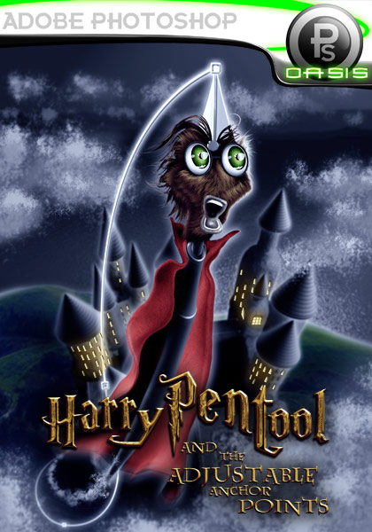
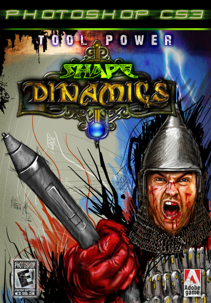
Finalist :: drizcol
Colin: I like the little touches such as the bezier path
Oliver: Had a good laugh, nice idea nd nicely done. Convincing cover!
Avi: Cute, beautiful illustration. How will Harry catch the snitch though?
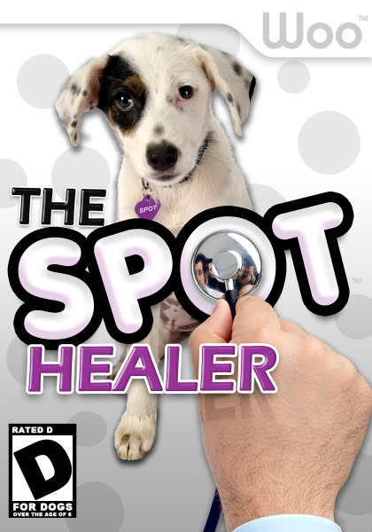
Finalist :: dug
Colin: This is a well designed piece with an eye-catching title. Its funny.
Oliver: funny just one entry had this idea, i found it to be pretty clear to try it.
Avi: clever and funny idea! The use of drop shadows behind the dog seemed to flatten it into 2D – I’d recommend darkening and blurring the background behind the dog to create some depth instead of using drop shadows… Something to help white pop more than another white background.
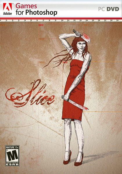
Finalist :: blackbird_bart
Colin: Original concept.
Oliver: Falls out of the other entries. Sleek idea, sleek feeling, sleek design. Love it.
Avi: Very unique. I almost missed the slice boxes. Really well done!
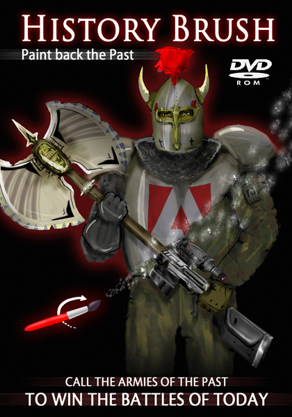
Finalist :: perhiniak
Colin: Hand drawn. I like the transition from the modern to the historic. Kudos for concept.
Oliver: Dunno what to say. Sorry.
Avi: Nice composition on the character during the transition, but the type treatment on the bottom confuses me a bit.
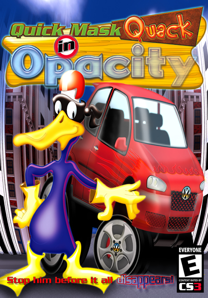
Finalist :: dtron
Colin: I love the type treatment on this. Looks like a good kids game.
Oliver: Shading, highlightning is niceley started but finished much too early. pitty.
Avi: cute kids game, great font treatment (on the top), great illustrations, nice car… In short really good elements, but altogether needs a little more breathing room in terms of composition.
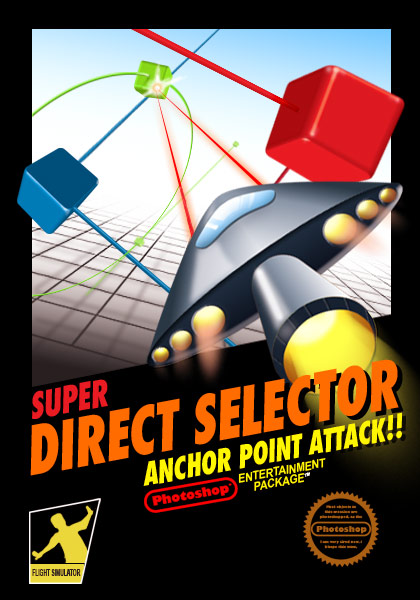
Finalist :: jayturner
Colin: Wasn’t crazy about this at first. After a closer look and realizing that the ship is the selection tool, I really like it. Reminds me on an old Atari game.
Oliver: The proof that not all retro is good. sorry. but execution is nice!
Avi: This is perfect to me. Solid concept, perfect composition, looks like an actual Atari game. Simple can be better sometimes and this shows.
Finalist :: stevegray
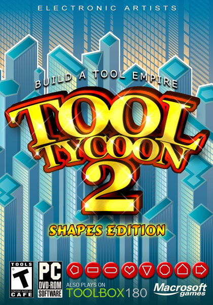
Colin: Interesting parody of Railroad Tycoon and Sim City.
Oliver: well, yes. don’t get it.
Avi: I like this one for it’s dead on parody of RailRoad Tycoon. The composition is nice, color scheme is nice. Obviously putting the type as the focal object was in keeping with the parody and it works here.
Finalist :: drizcol
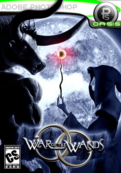
Colin: Considering these pieces were made from clay, its pretty amazing. Interesting fatasy game.
Oliver: nice lightning, nice ambient. cool piece.
Avi: really cool composition, lighting and characters. Wand glow gets a little too washed out against the moon, but otherwise really cool!
Finalist :: fraxxx850
Colin: I have to agree with Oliver. This is some really nice design work but more like a magazine editorial than a game.
Oliver: love it but it’s not a game cover i’m afaraid. style is very very good. go meet the gfx industry!!
Avi: Great graphics treatment, and I don’t think it’s unheard of to see graphics like this on a game cover, but it’s the negative space towards the bottom that moves the feel away from games. It’s like all the action is in the background with an empty foreground (and your lines create the illusion of a 3D plane) /
Finalist :: Nirtra
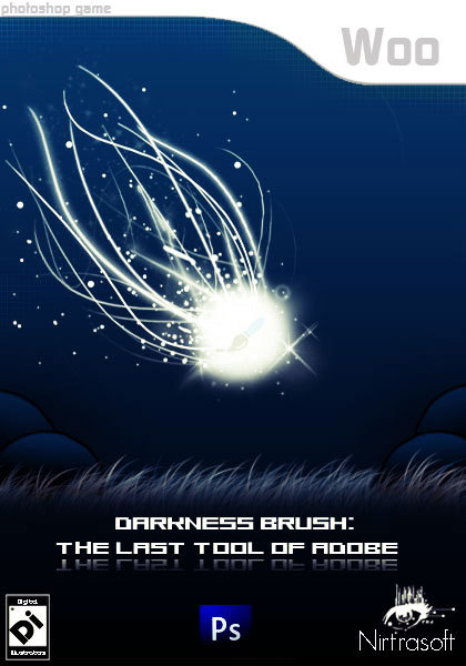
Colin: Simple but effective.
Oliver: I somehow really like it. nice ambience. nice idea in wording and execution. all points.
Avi: Pretty, simple, good lighting. Cool job.
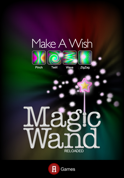
Finalist :: pusparaj
Colin: To be honest I think the colors are a bit muddy on this one. Nice idea of the magic wand out of the i though.
Oliver: somehow, allthough it’s not too “creative” i really like that. 5 out of 5 for sure.
Avi: Pretty composition and colors, but this reminds me more of a motivational poster than a video game cover. I feel that there is nothing inherently “gamelike” in this cover, other than the word “Games” and a type font for “reloaded” that almost looks like it was added last minute as an after thought.
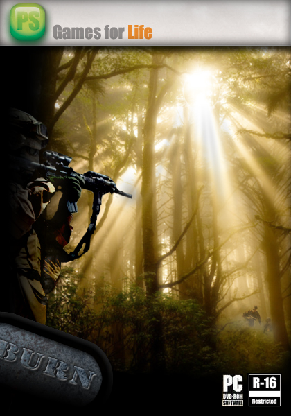
Finalist :: Mathew
Colin: I really like the lighting effects and the way the soldiers are coming out of the woods. Makes we want to play the game.
Oliver: Doesn’t look like a video game to me. Not sure how much PS work was done, looks like a nice photomanip to me but nothing much more.
Avi: I like the framing of the scene around the forest light. If that was hand made, it’s a beautiful effect. I’m not sure what the game’s title has to do with the game though.
\ 8 \ 9 \ 10 \ 11 \ 12 \ 13 \ 14 \ 15
The Judging…
1. Overall impact 40% of score
2. Concept 30% of score
3. Graphics skill 30% of score
The Judges: Colin Smith, Oliver Ottner, Avi Muchnick
The Rules:
The Specs…
600 pixels high x 420 pixels wide. Front of cover only, do not make a 3D display, just show the design.
Post entries here
The Rules…
2 entries allowed per contestant
Anyone may enter (except judges)
All entries to be posted on server at cafe (link) no later than midnight PST Jan 31st, 2008.
Good luck!
No pirated or ripped images are to be used. If you are caught ripping for the contest, you will be banned from all future contests at the CAFÉ.
No pornography or profane language will be accepted.
No political or racial imagery allowed.
Judges decision will be final and no argument allowed.
Sponsors
Total prize pool so far: $11,798 and counting!
Grand prize $7,065 value (+More coming)
The winner will be featured on the PhotoshopCAFE homepage.
 |
Creative Suite CS3 Design Premium $1,799
Adobe Systems |
|
|
Wacom 6×8 Intious 3 Special Edition Tablet $369
|
||

 |
Lensbaby G3 + Wide/Telephoto Kit +Macro Kit LensBabies $392 | |
 |
Strata CX Suite $995 | |
 |
Strata 3D [in] Plug-in Bundle $399 | |
 |
Color Effects Pro 3.0 Complete Edition 299.95 | |
 |
Dfine 2.0 $99.95 | |
.png) |
Premium Subscription to the Online Training Library® (one year plus exercise files) $375 |
.png) |
 |
Creative Edge Bundle | |
 |
Includes Photo/Graphic Edges 6.0 and DreamSuite Series One $349.00 | |
 |
Genuine Fractals Print Pro 5 – $300 | |
 |
Poser 7 $249.99 |  |
 |
Anime Studio 5 Pro $199.99 | |
 |
Manga Studio 3.0 EX $299.99 | |
 |
MediaRECOVER $29.99 | |
 |
Fluid Mask 3 $239 |
 |
 |
Bling! it $49.95 |
|
 |
Eye Candy 5 Bundle – $199 AlienSkin t-shirt |
 |
 |
FontAgent Pro 4 – $99.95 | |
 |
Photoshop CS3 for Digital Photographers DVD : By Colin Smith $99.99 |
|
 |
The Adobe Photoshop CS3 Book for Digital Photographers by Scott Kelby (Author) $49.99 |
 |
$69.95
2nd place $3,115 value (+More coming)
 |
Strata 3D CX $695 | |
|
Strata 3D [in] Plug-in Bundle $399 | |
 |
PhotoTools Professional Edition – $260 | |
|
Poser 7 $249.99 | |
 |
Anime Studio 5 $49.99 | |
 |
Manga Studio 3.0 Debut $49.99 | |
|
MediaRECOVER $29.99 | |
.png) |
Annual Subscription to the Online Training Library® $250 | |
|
Fluid Mask 3 $239 |
|
|
Bling! it $49.95 |
|
 |
Exposure 2 : $249 AlienSkin t-shirt |
|
 |
Mystical Lighting AutoFX Value $179.00 | |
|
Color Effects Pro 3.0 Select Edition 159.95 | |
|
FontAgent Pro 4 – $99.95 | |
 |
Adobe Photoshop CS3 Classroom in a Book. by Adobe Creative Team (Author) $54.99 |
|
 |
Lightroom Training DVD : By Colin Smith$99.99 |
3rd Prize $1,617 value (+More coming)
|
$399 | |
|
Poser 7 $249.99 |
|
|
$49.99 | |
|
$29.99 | |
|
99.95 | |
|
$149.00 | |
 |
$129 | |
|
Fluid Mask 3 $239 |
|
|
Bling! it $49.95 |
|
|
FontAgent Pro 4 – $99.95 | |
 |
Real World Camera Raw with Adobe Photoshop CS3 By Jeff Schewe and Bruce Fraser $44.99 |
|
.png) |
Monthly Subscription to the Online Training Library® $25 | |
 |
Photoshop and Dreamweaver Integration DVD: : By Colin Smith $49.99 |
Bonus Prizes! $150 Value
|
|
 |
by Vincent Versace (Author) $45.00 |
 |
By Mac Holbert $50.00 |
 |
by Scott Kelby (Author) $49.99 |
Posting instructions…
To attach your entry:
1. Click the back button to return the the main contest thread
2. Choose New Topic
3. hit the “choose file” button on the bottom of the page.
4. Navigate to the file on your Computer..
and upload
Don’t forget the entryis 600 pixels high x 420 pixels wide.at 72ppi. Optimized and saved as a jpg. No exceptions. Failure to abide by these guidelines will result in instant disqualification.
One more thing… no sigs on the entries please – You may comment on the Creation process this time. Ie 100% Photoshop, or if you are the photographers, photo credit etc.
PS If you want to change your entry, you will need to delete it first and then post a new one
Good luck all!
Colin
\ 8 \ 9 \ 10 \ 11 \ 12 \ 13 \ 14 \ 15
The Challenge… Design a CD Cover for a Photoshop Effects, Training Video. Must include PhotoshopCAFE and any original artwork you...
Design challenge 1, design a tshirt. Premium Photoshop design contest at photoshopcafe.com. Free to enter, win lots of valuable prizes...

Design challenge 7, design a Billboard, future or past. Premium Photoshop design contest at photoshopcafe.com. Free to enter, win lots...