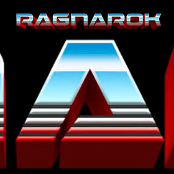
How to make Thor Ragnarok 80s Chrome logo in Photoshop Tutorial
Thor Ragnarok just broke records as the biggest opening movie.
One of the things that’s intriguing is the style of the film and collateral. As soon as I saw the poster, I thought it was interesting that they would go for such an 80s feel The chrome logo, looks like something from 80s hair metal. So, I decided to make a Photoshop tutorial, that shows you exactly how to make this logo, step by step. I hope you enjoy it.
I hope you enjoyed this tutorial. (written steps coming soon).
Check out all the other free tutorials here at PhotoshopCAFE!
Add a comment and subscribe to our newsletter so you never miss a new tutorial.
Hey, Cafe Crew, it’s Colin Smith here from Photoshop Cafe and today, I am going to show you how to create the type from Thor Ragnarok.
Alright, so what we are going to do is we are going to start with the Type tool, make sure to select Black as our foreground color. And we are going to type in Ragnarok. Now, notice the font I am using here ‘Dameron Bold’ and I got that from DA font. You might some others that are more accurate but it is pretty close to what they are using. And I am just going to increase the size of it. And we are going to drop that in the middle there.
Alright, let’s just create a new layer. And what I am going to do is I am going to just hit the Ctrl key or the Command and click on the Type here and make a selection and make sure, our layer on top is selected. Now we are going to fill it with a gradient. So we need to find those colors. So let’s click on the Gradient Tool and when you see that make sure Linear is selected and then you will see the Gradient Swatch. Click on there and this will pop it open. So let’s make the gradient by the way, it’s incredibly 80s kind of a looking thing there, you feel like you want to drive an ‘Iroc Camaro’, maybe it’s kind of the humor there, I am not sure.
But anyway, so we are going to click on this there and now what we want to do is we want to get rid of this color stop by just clicking and dragging it away. Now we are going to click on the next one and we are going to change this to red. So let’s grab that red that we are using right here, click OK, and now, we are going to click and drag the white one, pull it away.
Alright, let’s pull this way down here and then we are going to take this middle, this is where the two blend, we are going to pull that across because we want that to look pretty much like that. I think that’s pretty similar to what we see on the logo and then I am going to click OK.
Now, I am going to, with the gradient tool still selected, linear, normal. We are going to start at the top and I am going to hold down the shift key and I am going to drag it down and then I am going to release and then what that does is it creates our Type and I am just going to click away.
Alright, so we have got a gradient on top. Then next thing we need to do though is we need to put that white outline around it but the white outline doesn’t go around the whole type, just around the top and it fades out. So, I will show you a little trick for that. So I am just going to hit Ctrl + J to copy it and then I am going to hide this layer in between, so you can see we have got the black and just so we can see what’s going on when we do it.
Now, let’s go down here and maybe, if we want to change our background, to black, it might make it easier. Alt + Delete, Option Backspace on Mac will fill with the foreground color with just black. Alright, let’s select our layer on the top, here we are going to choose effects and now, we are going to choose stroke. And let’s just pull this out of the way, so we can see what’s going on. What we want to do is create a nice white stroke and notice its inside and that’s looking good.
Now, we want this to fade out around about the middle. So what we are going to do is we are going to create a new layer mask, then we are going to grab our gradient tool and then we are going to change this foreground to background. There we go. And notice it is looking really weird. That’s okay. Let’s turn on our layer underneath and now, what we are going to do is fix the reason why it is looking so strange. So if we go under here and we double click on effects, and we go and we have our blending options, just turn on layer mask hide effects and boom! Now it is going to look good.
Very simple!
Alright, we are getting there. We are very close. We have got two other things that we need to do. We need to create this little kind of glim in there and we also need to get the 3D extrusion. So why don’t we start with the 3D extrusion and I am going to go down there, we are going to hide this so that we can see it. And we are going to select our type layer. And of course, if I hide the background, you can see it right there. Now, we are going to go up under 3D and we are going to choose new extrusion and it is going to pop up, ‘Do you want a 3D workspace?’ – yeah, sure, why not? So we have got our extrusion but we need to make that extrusion red and we need to make it go down a little bit. So what we are going to do is, why don’t we have a look at the color? So if you see under the 3D panel, go to the materials one which is the third one over, and we are going to choose the extrusion material, under the [Inaudible 04:49] make it red, click OK. There we go.
Now we are going to change the shape of this. We will click once on the type and you will see this little gimbal thing here and I am going to drag it up. We are going to bring it up near the top here and notice that lets the extrusion show through a little bit more and maybe even increase the depth a little bit. Give it a little bit of red. Looking close, we got to fix the lighting. Click this little light icon and this enables us to set the direction of the light which is more coming from this direction which is close to what they do on the movie poster. Okay, so another thing we need to do this turn the shadow off because we don’t want any shadows because they didn’t use any. And that’s looking pretty good.
Alright, so let’s go back to our layers panel and we are going to select our two layers there, when you select the layers, Shift select, get both layers here. So now what we are going to do is just drag this up, I am going to hold down the shift key, so we keep pour positioning right on top. Alright, looking good, so now we are still going to do this little glassy thing here and also the grooves in there. So why don’t we create these grooves now?
So what I am going to do is I am going to just create a new layer on the top and I am going to grab the line tool, okay. With the line tool, I have set it to about 4 pixels right now and I am just going to select and drag across and I am using black right now. I am just hitting the V key, just to hit the move and I am just going to pull it down. Now I want to copy this, so that would be Ctrl + J, Command J on Mac and then I am going to hold down Shift and hit the arrow key, the up arrow key once. Let’s do the same thing again, Ctrl + J to copy, Shift arrow key and that moves it up one more time. Alright, let’s do it one more Ctrl + and Shift and arrow to bring it up one more time. Alright, so we have got those lines and now, there’s a couple of ways that we can do this. Let me select these lines here, that’s the four layers and I want to merge them together. Ctrl + E and that would be Command E on Mac to merge. Now, there’s a couple of ways of doing this. One of them, I could drag it down here and if I hit the Alt or the Option key, while I go between the two layers and I click in here, I can clip those in there. See that? And that actually works quite well.
The other way I could do it if I wanted to actually cut that out and put a little bevel in there, if you really wanted to do that but I think this is going to work quite well. And let’s turn our background on.
One last thing left, if you noticed inside here we have this kind of like glassy kind of 80s, cromy thing going on, let’s just call it that. Alright, so let’s do that now. So I am just going to create a new layer and then what I want to do is I am going to grab our Line tool one more time, but this time make sure to set the pixels, make sure the foreground set to wide and let’s go little bit wider, I don’t know, maybe 8 and I am just going to drag that across and then just kind of bump it up a little bit. Okay, looking good. And I need to get that above everything else. Okay, great. So what I am going to do now is I am going to just blur it. So I am going to choose filter blur and we are going to grab that Gaussian Blur. And that’s not bad, maybe a little wider, there you go. This is looking quite good. And I want to kind of double up on that, so Ctrl + J and that gives us two of those layers and I select them together, hit Ctrl + E to merge them and maybe add a blur one more time. Okay, there we go. And I am going to hit Ctrl + J again, just to increase the density of that. So what I should have done is maybe just start with a wider line but this will work fine. So we hit Ctrl + E once again, selecting the two layers to get them in there.
Alright, so what we want to do now is we just want to make them fit within that area. So the way to do that is just Ctrl + Click on the type layer, that selects the outline of the type, we want to just mask that out, so we just going to click on the layer mask and notice that that gives us that there and we are almost there.
I have got one more thing that I want to do and that’s just to create that kind of little curvy thing in there. So why don’t we go in and that’s a technical term and we are going to grab the pen tool. Now, if you are using the Photoshop CC 2018, you will notice is a new curvature pen tool. So all we are doing is we are just dragging across and I am just going to make curve in there, you will see what I am going to do in a sec, and see with this curvature pen, we could actually click in there and create this wavy little thing by clicking and dragging like that, see that?
Now, of course, you can do this manually with the pen tool, just by dragging around. Alright, so that’s pretty good, let me bring that one down a little bit though and I will bring this one down. Cool, so we have got, okay, let’s add a little bit more. There we go. So we have got that kind of wavy thing, you know, it is a very kind of 80s computer, early computer kind of way of creating it, it is kind of fun effect, it is kind of cool that they did this.
So let’s go around here, we are just going to click around to just kind of close this path out. Excellent. Now we need to make a selection out of this. So what we want to do is we just want to get on to the [Inaudible 10:30] panel if it is not showing. So we just going to window, [Inaudible 10:34] and you will see the [Inaudible 10:37] panel and then all we need to do is Ctrl + Click or Command + Click on Mac and that makes the selection around there, excellent. So let’s go to our layers panel and all we want to do now is just fill that part of that mask with black. And notice we have got the foreground color now is black. So if we just hit the Alt + Delete on Windows and that would be Alt + Backspace on Mac and then we just turn off Ctrl + D and there we go.
Alright, now I am going to show you how to create the bevel around these slots, just for fun. So if you remember, we’ve put them on this layer. So all we need to do is Ctrl or Command Click to load the selection from that layer. Now we are going to hide it and then the next layer down, notice that this is our type. So we are just going to go on there and we are just going to hit the Delete key and then Ctrl + D to turn it off. And now we have actually got the cuts. Now, if we want to give these cuts that 3 Dimensional [Inaudible 11:40], what we are going to do is choose effects and then we are going to choose bevel and emboss. And notice that when we turn that bevel and emboss on, that is looking a lot more like what we have got in there. In fact if you turn that depth down a little bit and play around with the size, to about there, click OK and that’s pretty much what we have got there on the logo.
Alright, so there we go guys.
If you liked this tutorial, smash that Like button into dust. If you like Photoshop tutorials, I do at least one a week, make sure you hit the subscribe button right now, become part of the Cafe Crew and you get my new tutorials every week. Add a comment, I would love to talk to you and until next time, I will see you at the Cafe.
Great to see you here at the CAFE
Colin
PS Don’t forget to follow us on Social Media for more tips.. (I've been posting some fun Instagram and Facebook Stories lately)
You can get my free Layer Blending modes ebook along with dozens of exclusive Photoshop Goodies here
One thought on “How to make Thor Ragnarok 80s Chrome logo in Photoshop Tutorial”
Leave a Reply
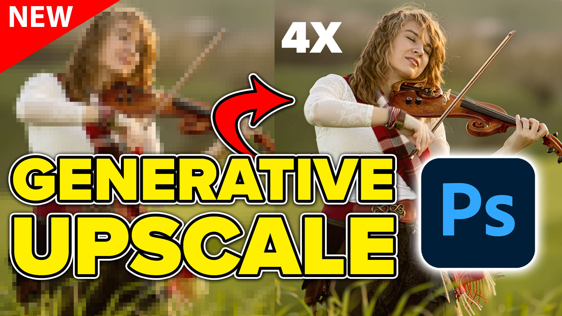
Generative upscale in Photoshop and how it compares to Photoshops other ai resizing tools.

How to use Split Warp in Photoshop 2020. (It does more than you think)/ This deep dive shows how to...

How to make Silky metal edges and a bubbly shiny glassy text in the free Photoshop Tutorial.


I loved Thor Ragnarok! Can’t wait to see it again. This tutorial is on point! I’ll give it a shot! Thanks 🙂