How to make the colors match between different photos in Photoshop
People really struggle to match the colors on different layers when they are combining photos in Photoshop. This is one of those tutorials that has been requested for quite a long time. This tool isn’t new in Photoshop, but I’m surprised how many people don’t know that it even exists. So without further rambling from me, let’s jump in and do this! Don’t forget to subscribe to the newsletter and become part of the CAFE CREW! Who? That’s you 🙂 But really, subscribe!
Matching Colors When Combining Photos
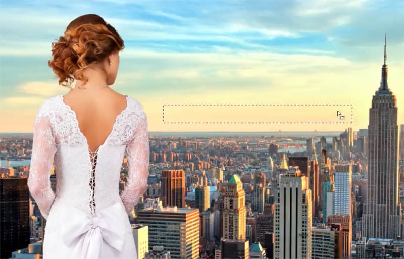
I’m going to show you how to match the colors between backgrounds and objects once you’ve cut them out and combined the different photos or otherwise known as compositing.
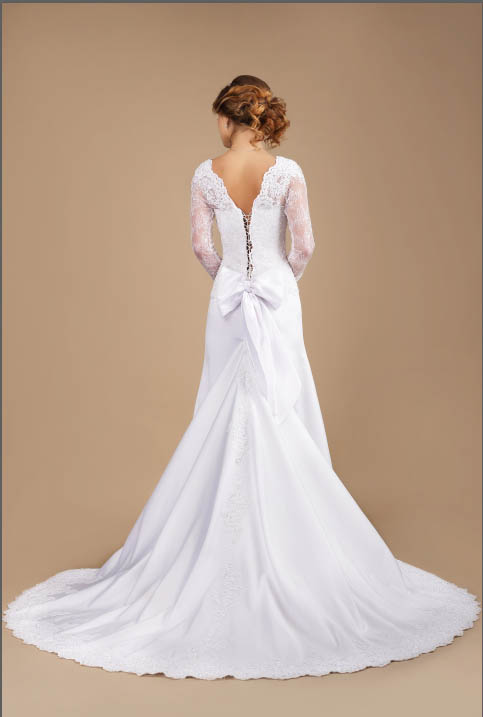
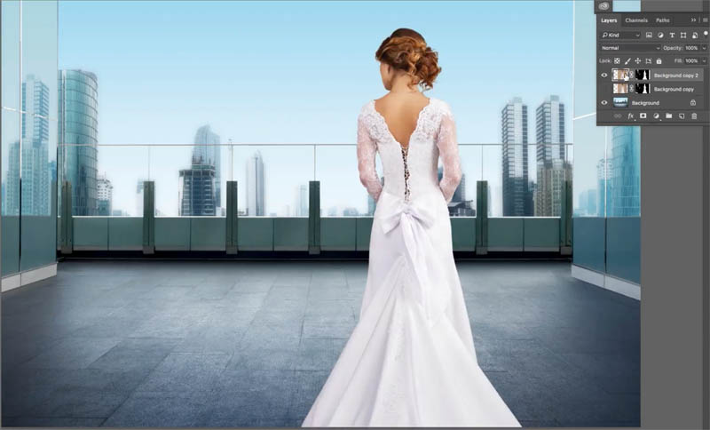
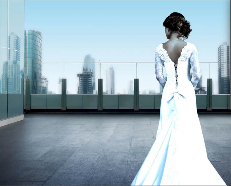
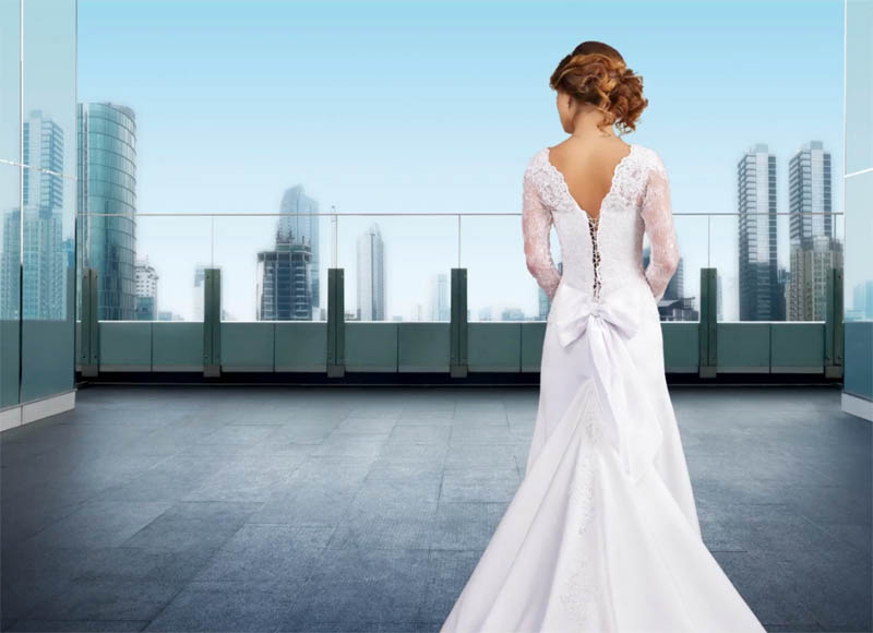
I’ve grabbed some photographs from Adobe Stock. I have a photograph of the woman and two different background because I’m going to show you two different scenarios with two different techniques: A simpler, more monochromatic cooler image and a more complex image with multiple colors.
You can find the photos here
When you are compositing or combining images from different sources such as your own photos or photos from different stock sites, oftentimes the colors don’t match. This tutu will show you how to match them.
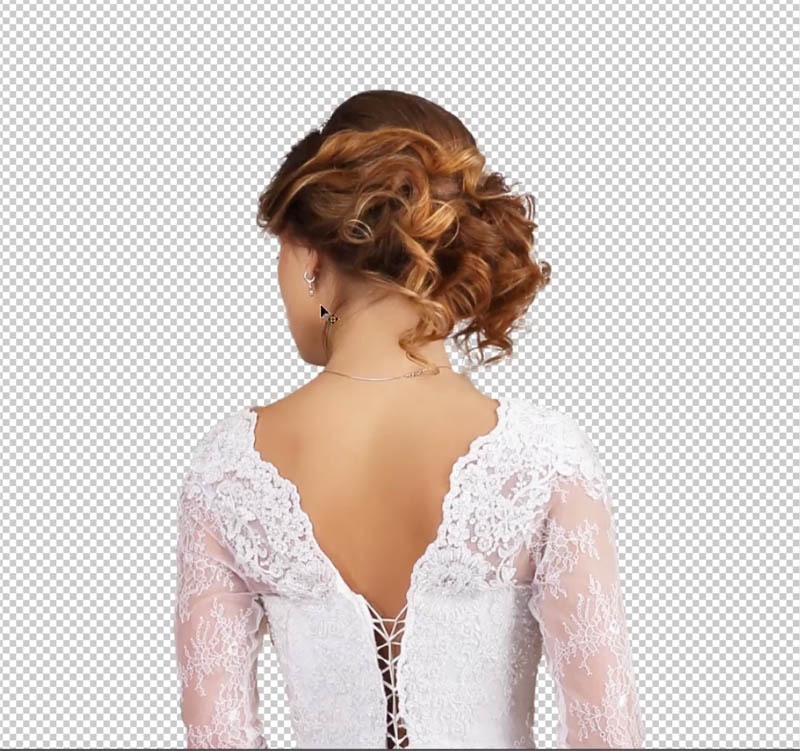
I’ve cut out the lady, as you can see. And I’m not going to go through those steps because I’ve got lots and lots of tutorials on how to do that. I’m going to show you how to make the colors match.
Example #1 Basic Match Color in Photoshop
Lets get started with the first example.
Step 1
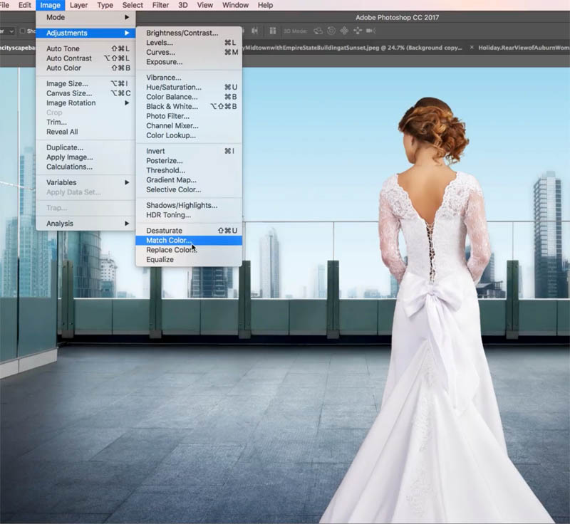
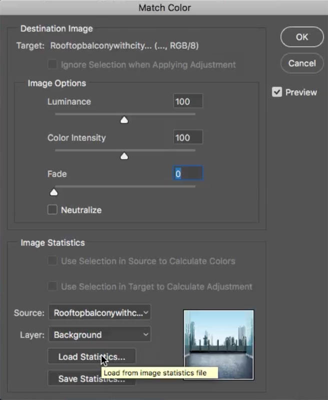
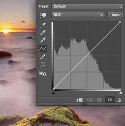
Make sure you have selected the layer that you want to change the color on (the woman). Choose> Adjustments>Match Color.
Step 2
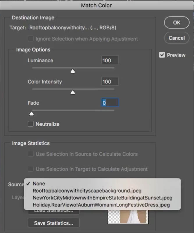
Under the Match Color, we want to choose the background for the overall toning from this background and apply it to our woman.
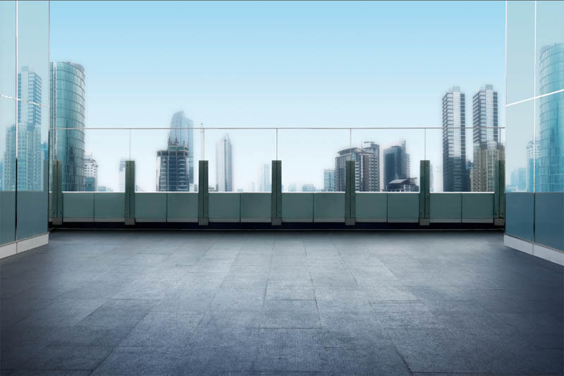
Under Source, choose the right source “roof top balcony with cityscape” That is the document we’re working in.
Step 3
Under Layer: choose the background layer. Now, immediately, it’s going to apply the color for the background. No, it doesn’t look good yet. Don’t worry, relax, we’ve got a few steps we’re going to take care of.
Step 4
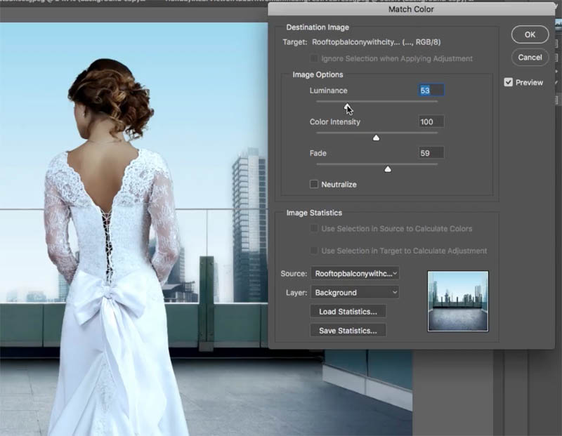
The fade slider is how much of that color is applied, so it’s kind of like a volume control for the color. So let’s bring it up until we get to about the right amount. Don’t worry about the toning or everything right now, just the color.
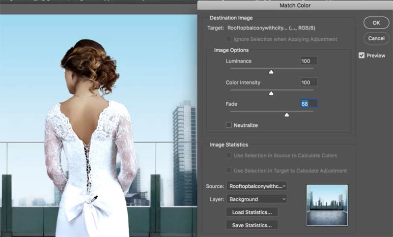
I’m looking at the colors here in the white, and that’s why I chose this woman in the white dress. It makes it easy to kind of see the color toning
Step 5
And the next thing we want to adjust is the luminance (the brightness). Let’s bring it back a little bit. It was getting blown out and losing details.
Step 6
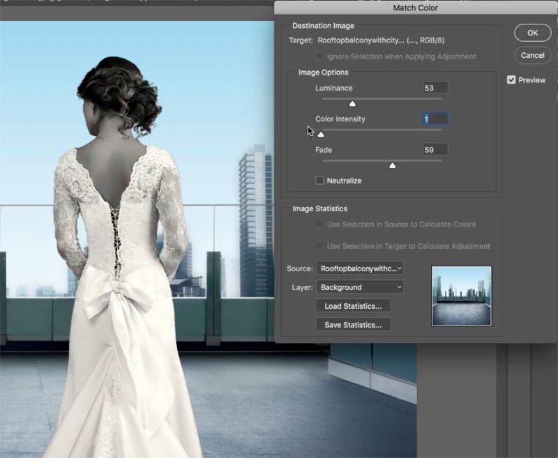
All right, so we can come back and we can adjust things later, don’t worry. But the next thing is the Color Intensity. This is kind of like a saturation. If I bring this down, notice it’s going to go completely black and white.
If I go all the way up, it’s going to go very, very colorful.
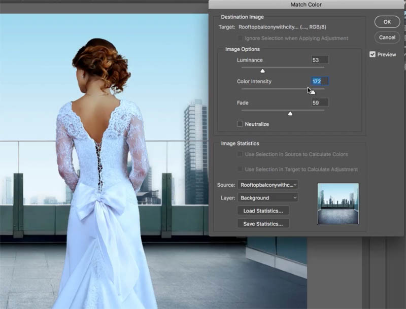
I’m noticing that this scene is a little bit desaturated, so I’m actually taking this less than 100 because we want to match that.
Step 7
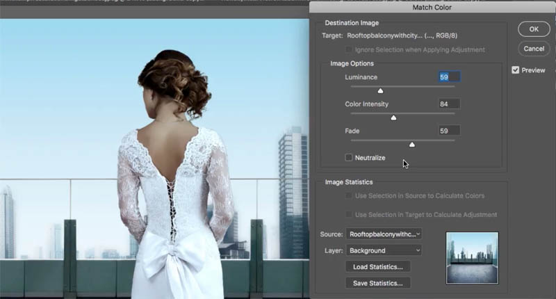
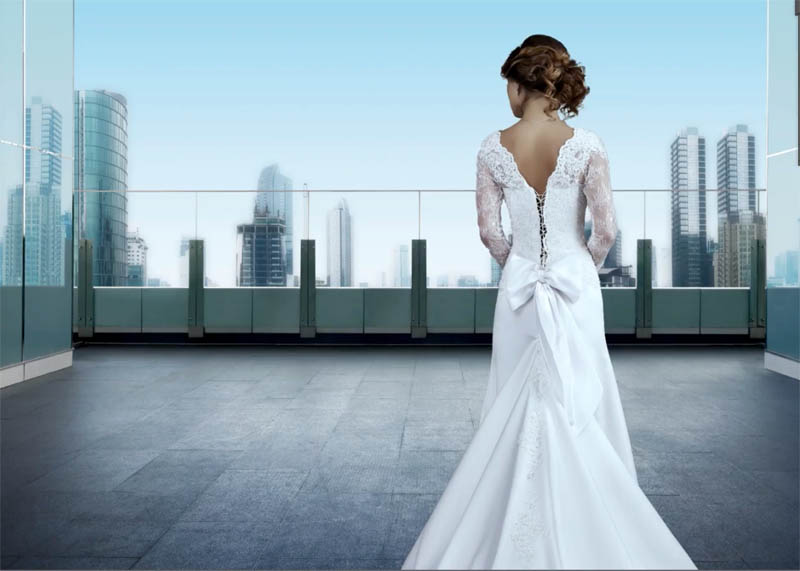
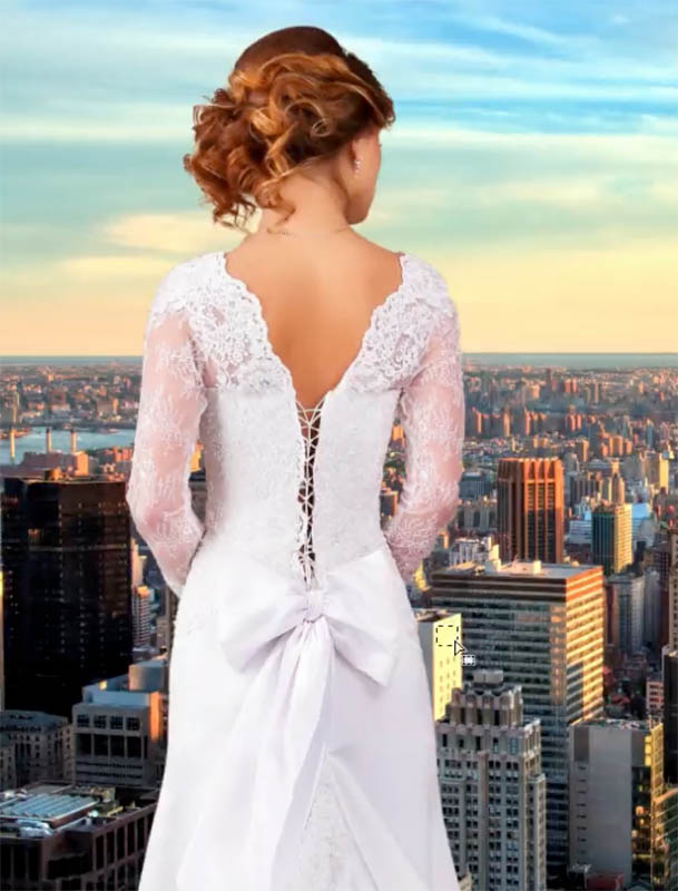
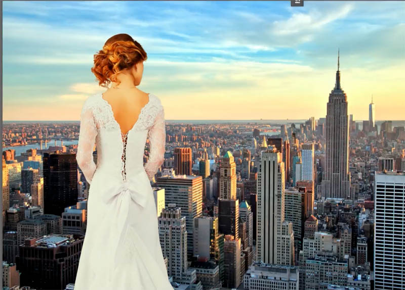
So let’s have a look at this. I’m just going to apply it and let’s see the before and the after. There’s the before, where she was much warmer than the background,
and the after, where it matches. Now, you could adjust the brightness of her if you want to using Curves or do that on the next image, but this is not bad.
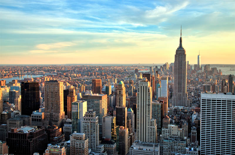
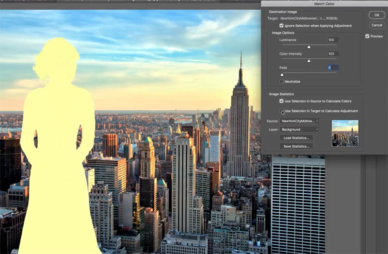
Example #2 Advanced Match Color with Selections
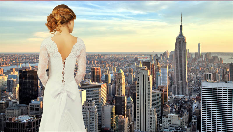
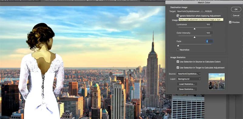
So let’s go to the next one. So let’s choose the image. If we go down to our adjustments, and we go down to match color, this is not going to work and I’ll show you why. If we repeat all the previous steps this is what’s going to happen.
It’s going to get weird now because it’s selecting the blues. It’s selecting all the colors from the sky and the ground and it’s creating kind of an average color and it’s just not going to work.
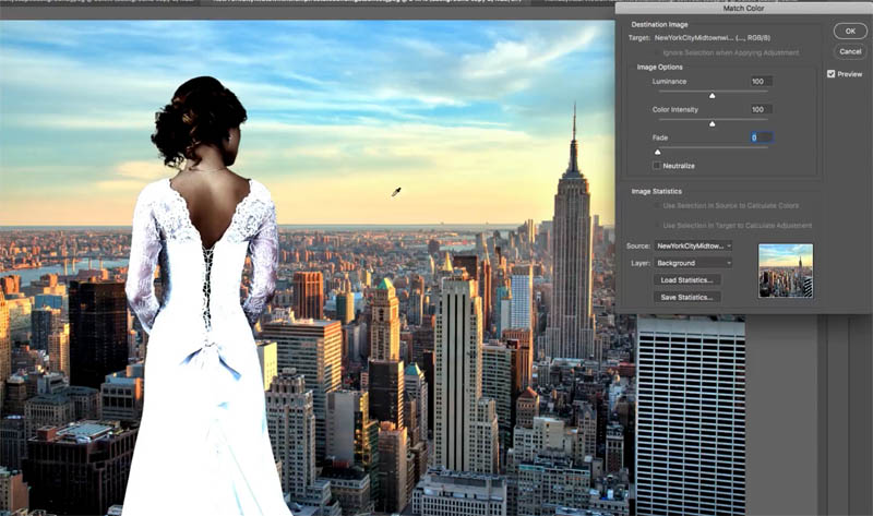
Step 1
So here’s what we do, we grab our Marquee Tool and we’re going to make a selection around here where we’ve got this color
That’s one way you could do it.
Or if you want to be even more accurate, what you want to do is look for an area that would normally be neutral gray, say this building here, and just make a selection around there.
Look for something that should be gray that’s obviously being hit by the sunlight; not the shadow, otherwise, you’re not going to get the color.
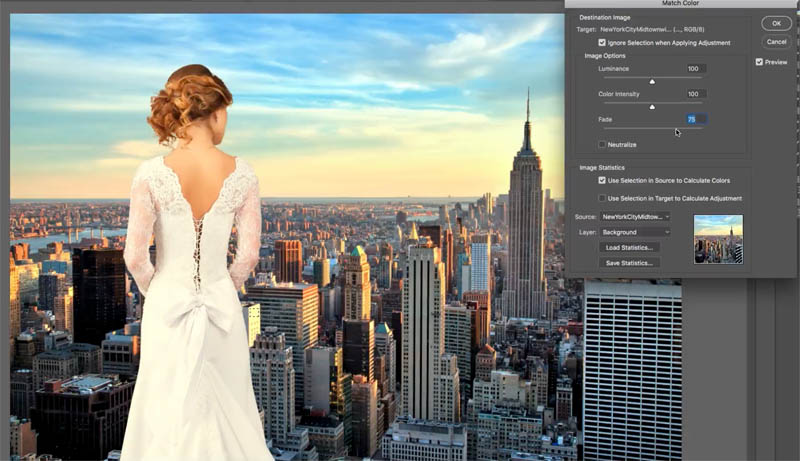
Step 2
Choose>Adjustments> Match Color.
Set up everything as before (Choose the same document as the source and the background image for the Layer.
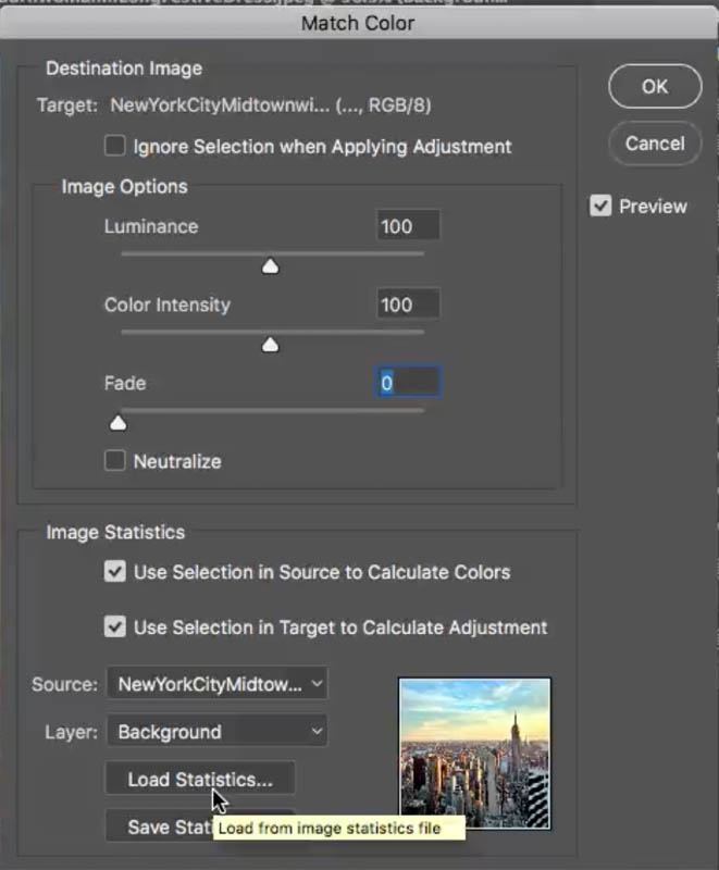
At first it seems nothing is happening. Turn on “Ignore Selection..” when applying it.
Notice it looks weird right now,
Step 3
Turn off “Use Selection in target..” now it’s taking that color and applying it to our source, , which is our person; so far, so good.
Step 4
Now, we want to turn our Fade down
Step 5
And now we play around with that Luminance, so let’s take that luminance down to about where we want to match it.

Step 6
Let’s play around with the color intensity and you can see it’s starting to look a lot better now.
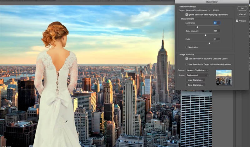
All right, so as you can see here, this is applied and we’re just going to click OK.
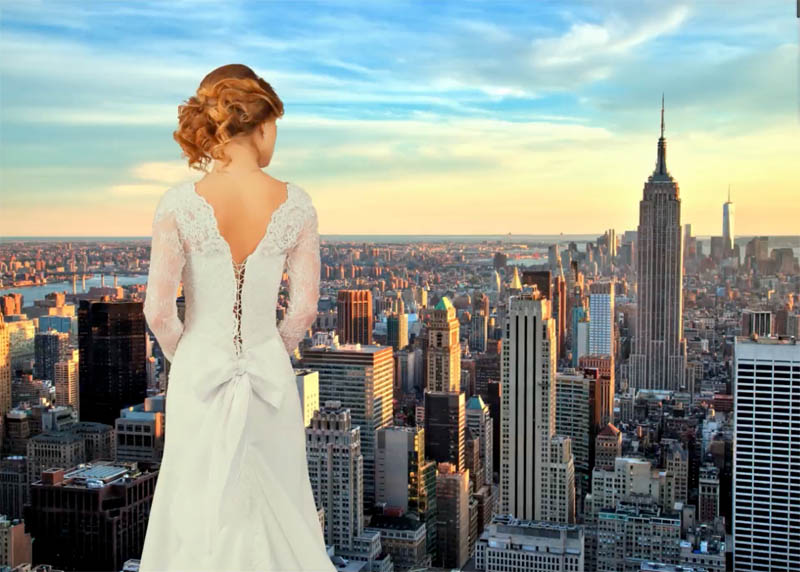
Step 7
Now there’s one more step we need to do after this.
We need to add a little bit of contrast. Go under the Adjustment Layers and we’re going to apply a Curves Adjustment.
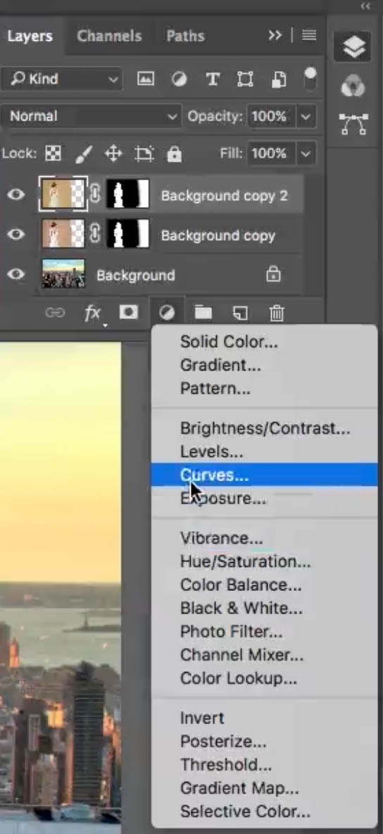
Now, I only want to affect the layer underneath. I don’t want to affect all of the layers, so by clicking that little box, it’s only going to affect the layer directly underneath, which is our lady.
This creates a clipping group for our adjustments.

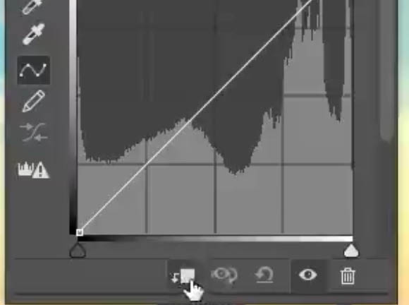
Step 8
In the Curves we’re going to go into Shadows, pull it down to kind of match it a bit more. And what we’re going to do is go up in the highlights and give those a boost (Slight S-Curve). And we’re adding more contrast to this image.
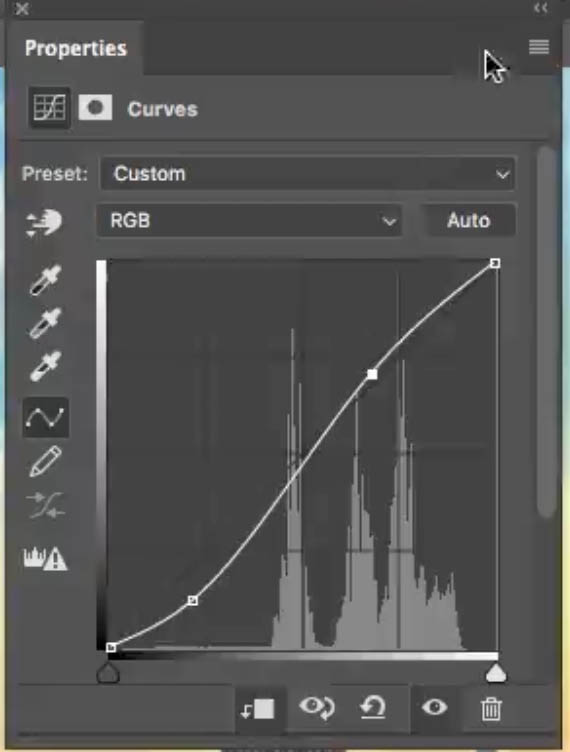
And if you feel like the curves are just a little too much, you can always adjust the opacity of those and just give them just the amount you want. So, anyway, there you have it guys. That’s how to match the colors when you’re compositing between the foregrounds and the backgrounds.
Browse our hundreds of other free tutorials here, or search for what you are looking for in the search at the top of the page.
If you are ready to get serious about Photoshop, see our full length courses here
PS Don’t forget to follow me on Social Media>
(Ive been posting some fun Instagram and Facebook Stories lately)
Great to see you here at the CAFE,
Colin
PS Don’t forget to follow us on Social Media for more tips.. (I've been posting some fun Instagram and Facebook Stories lately)
You can get my free Layer Blending modes ebook along with dozens of exclusive Photoshop Goodies here

19 thoughts on “How to make the colors match between different photos in Photoshop”
Leave a Reply
How to remove People in Camera RAW, ai people removal in ACR
Create clean circular and arched text using Dynamic Text in Photoshop

Use this trick to Fix color in any photo in 1 click in Photoshop, Lightroom or Camera Raw


I never knew how to use that feature! Thank you!
Su
Colin,
This article was just what I needed. After retiring as a Forensic Photographer, I began volunteering through United Way at the local county Historical Society which needed someone with photography, scanning and data entry skills to image historical objects, blueprints and posters. Some of the posters had to be scanned in sections because they were too large for their 11X17 scanner. Learning how to match the colors of the individual images before stitching them together has been a big help.
Thanks for the tutorial.
Thank you for sending these videos. What I especially appreciate is the individual slides you include that correspond to the video. If I miss something in the video, I can reference it through your slides.
Again, thank you!
You are welcome. I’m working on having written steps for every video. Sometimes it takes me a few days to get them up and another couple of days to nicely edit them.
Thank for tutorials colors match but while i was watching it deleted cuold you please send again.
Carol
Hi Colin,
You offered a free ebook this morning, but now I can download it, it has disappeared. Love your work
If you subscribe to our newsletter, I include a link in the weekly mailing, check your inbox.
Wow, Colin, that tutorial about matching the foreground and background is so simple yet makes a huge difference to the shot, thank you. Have you a tutorial about completely changing the colours of an object without losing the texures, shadows and highlights?. It is one area that I haven’t touched on much, but would like to learn.
Great tutorial!
I’m having an issue with after making the marquee box on my image the “Adjustment” layer will NOT light up, so I cannot select the match tool. any ideas?
I love this
I finally found this tutorial
C’est une merveilleuse découverte,
I have a composite image with multiple layers of a person masked out with no background. How do you color match between individual layered masked human figures without a background image?