Photoshop Beta New Color and Vibrance – Temperature vs Tint in Photoshop Explained
Understanding Temperature vs Tint in Photoshop (White Balance Explained)
White balance can be a confusing topics for photographers. In this tutorial, we’ll clear up the difference between Temperature and Tint—and we’ll also look at a new tool in Photoshop Beta that makes fixing color casts easier than ever.
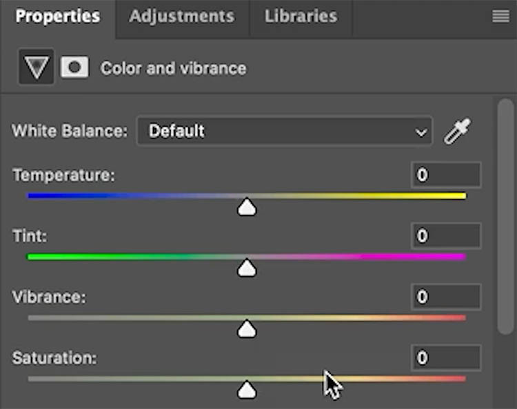
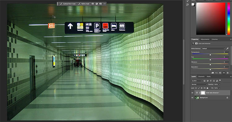
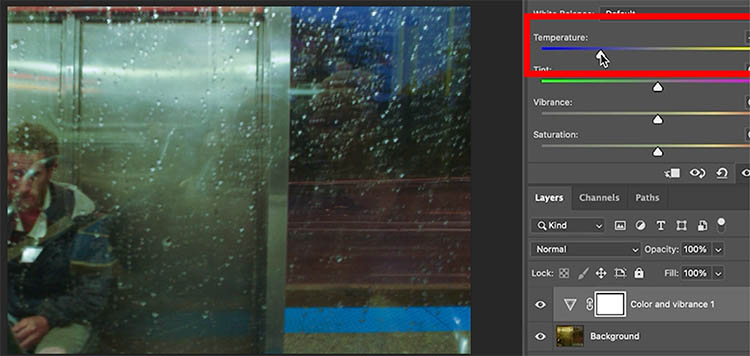
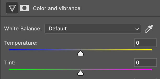
The New Color and Vibrance Adjustment
Before diving into the concepts, let’s look at what’s new.
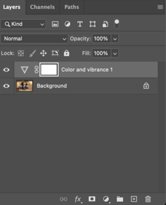
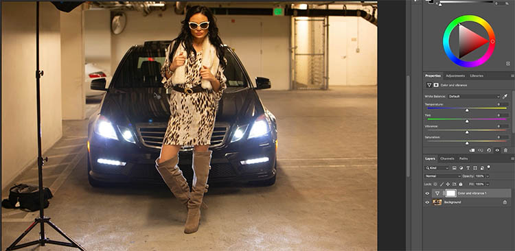
In Photoshop Beta, go to the Adjustment Layer icon and look for Color and Vibrance at the top.

This used to be just Vibrance, but now you’ll notice two new sliders: Temperature and Tint.
You might be thinking, “We’ve had these in Camera Raw for years.” That’s true—but they’ve never been available natively inside Photoshop layers until now.
And while they’re related, Temperature and Tint do very different things.
Understanding Temperature
The Temperature slider controls the balance between warm and cool tones in your image.
Move the slider to the right, and the image warms up with yellows and oranges.
Move it to the left, and it cools down with blues and cyans.
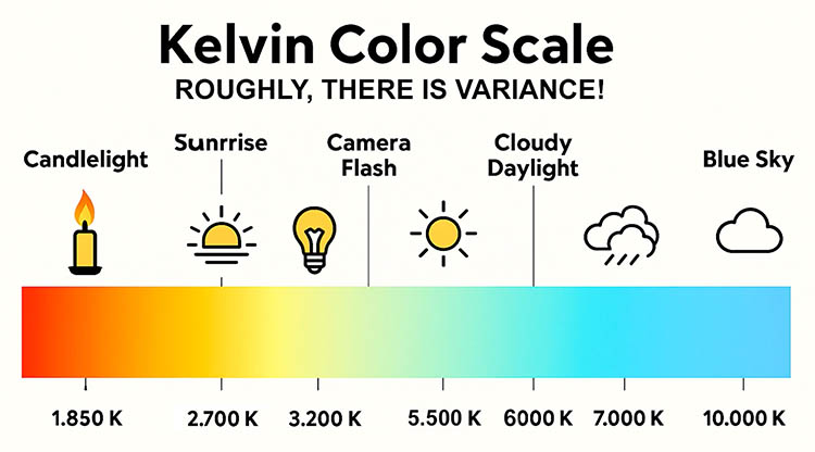
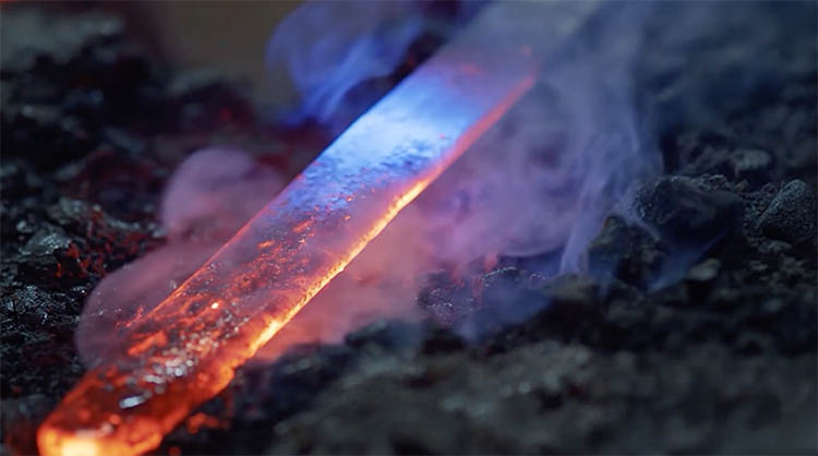
These values are based on real physics, measured in Kelvin, the same scale used by scientists to describe the color of heated light.
-
Lower Kelvin = warmer light (think candlelight or tungsten bulbs).
-
Higher Kelvin = cooler light (like open shade or daylight).
It might seem counterintuitive that lower Kelvin values create warmer colors, but if you think about heated metal—red-hot becomes white-hot, then bluish as it gets hotter—it makes sense.
Tip: You don’t need to memorize Kelvin numbers to correct your images. The Temperature slider makes it intuitive.
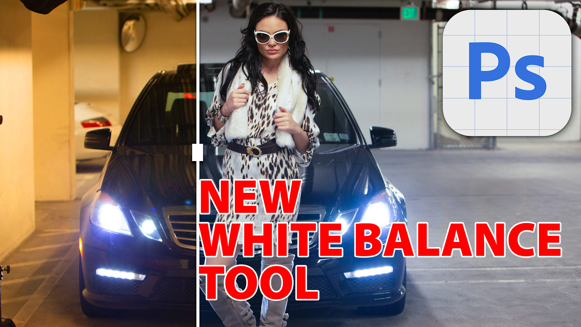
Fixing a Warm Image in Photoshop Beta
Let’s put this to work.
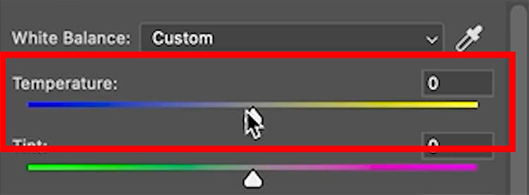
In Photoshop Beta, add a Color and Vibrance adjustment layer.
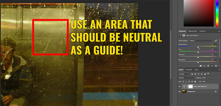
To see if it’s too warm or cool, look for something that should be neutral white or gray and see what color it is. It takes a little practice to recognize the type of color cast, but it will become easier with practice.
If your image looks too warm, drag the Temperature slider to the left to cool it down.
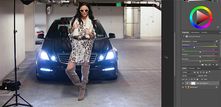
Watch as the blues balance the warmth, removing the color cast instantly.
Tip: This is the first time you can adjust Temperature directly inside Photoshop without opening Camera Raw—perfect for layer-based edits and masking.
Using the Eyedropper for Quick Correction
Another quick method is using the Eyedropper Tool.
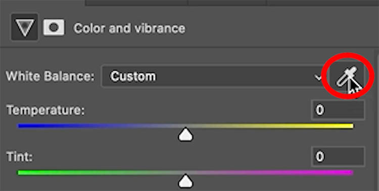
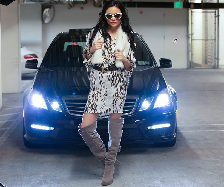
Find an area in your image that should be neutral (like a white shirt or gray surface) and click it.
Photoshop automatically adjusts the white balance for you.
You can also do this inside Levels by selecting the white point Eyedropper. However, the new Color and Vibrance adjustment produces cleaner, more consistent results.
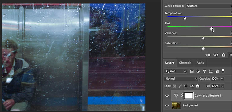
Understanding Tint
Next up is Tint.
While Temperature moves between blue and orange, Tint shifts between green and magenta.
It doesn’t make the image warmer or cooler—it fine-tunes subtle color casts.
Fluorescent lights, for example, often introduce a greenish tint.
Drag the Tint slider toward magenta to neutralize it.
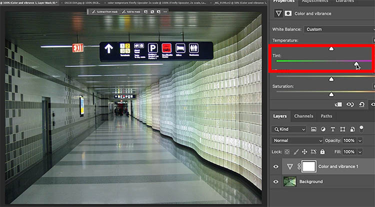
If your image has a magenta cast, move the slider toward green instead.
Combining Temperature and Tint
Often, you’ll need to adjust both sliders together.
For example, cooling an image may fix the yellow cast but leave a hint of green.
In that case, adjust the Tint slider toward magenta to balance the tones.
Having both controls right inside Photoshop makes these small adjustments much faster.
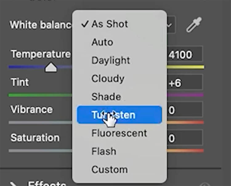
Seeing It in Camera Raw
If you open a RAW file in Camera Raw, you’ll see the same Temperature and Tint controls.
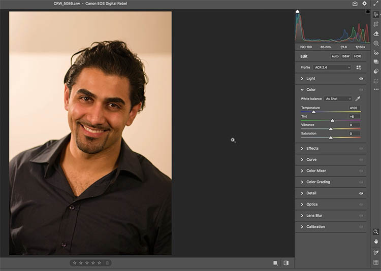
These are applied directly to the RAW data, and their values match your camera’s white balance settings.
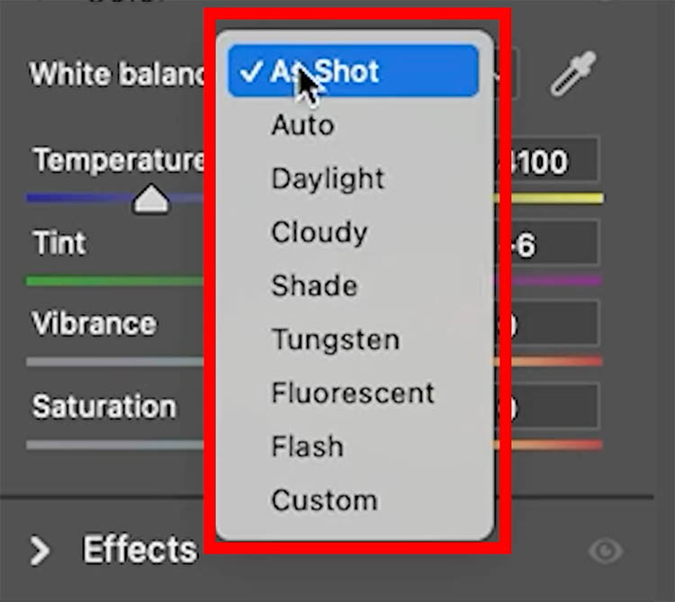
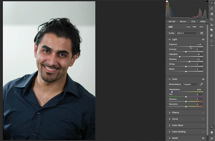
For example, if a photo was shot under tungsten light, choosing Tungsten instantly removes the orange cast by cooling the Temperature.
From there, you can fine-tune exposure as needed.
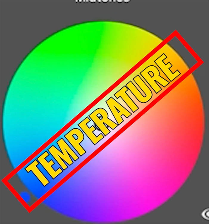
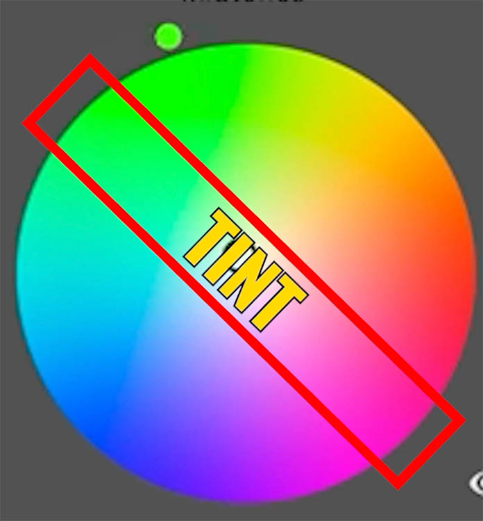
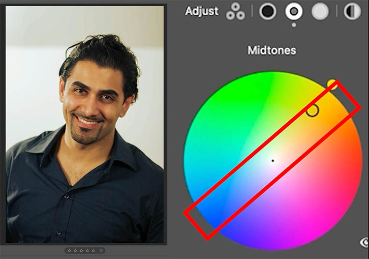
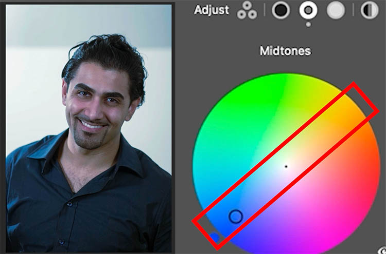
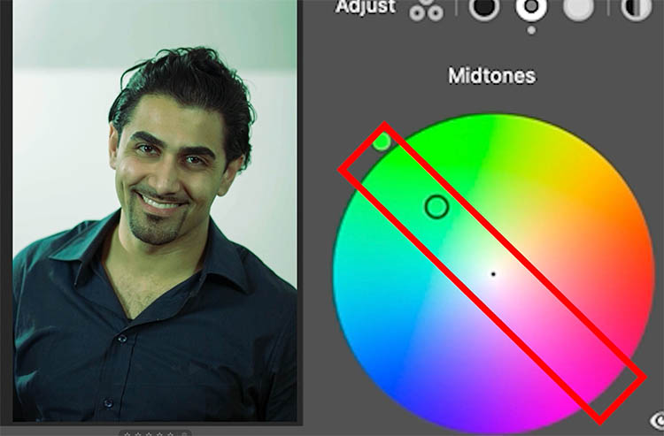
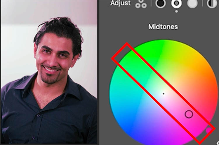
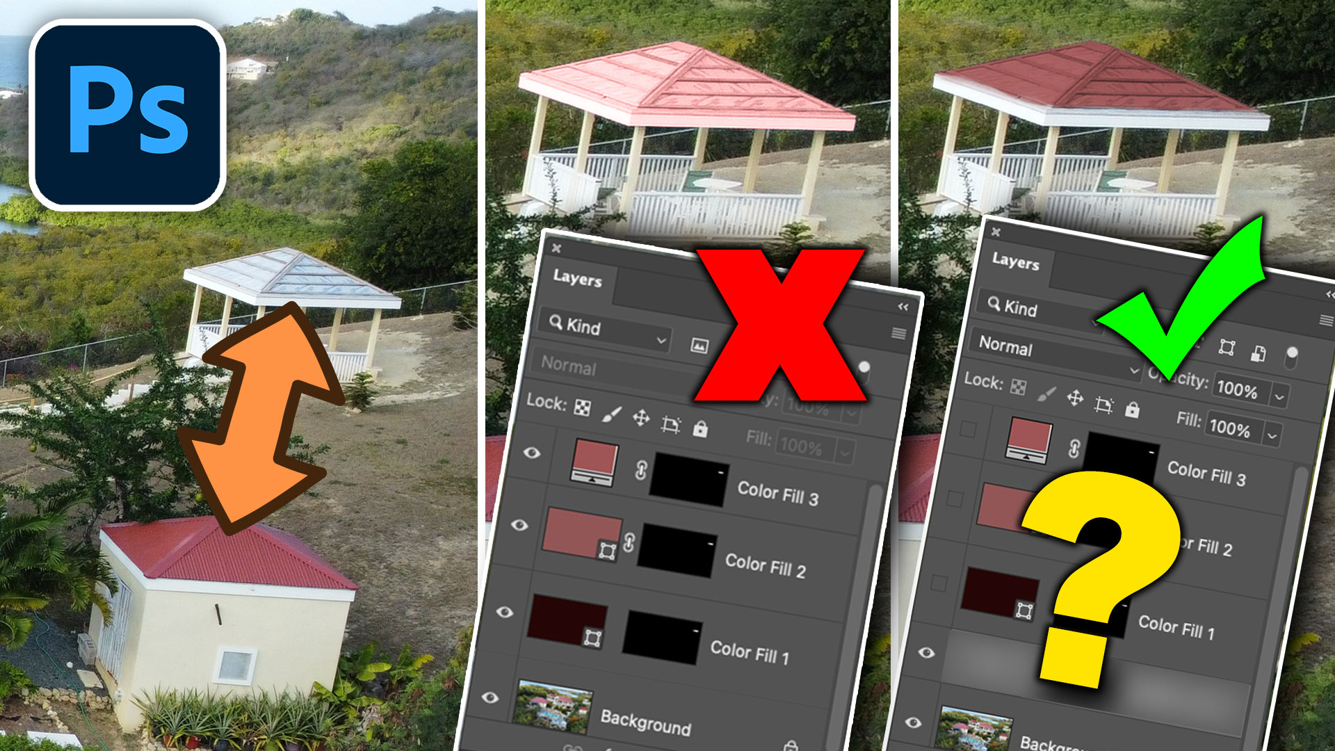
What its a color cast?
In the Color Grading panel, you’ll notice the colors on two axes—one is warmer to cooler (temperature), and the other is green to magenta (tint).
To understand how they work together, imagine a color wheel.
Go across the wheel and look the colors, (blue to orange) represent Temperature.
Choose the perpendicular line (green to magenta) this represents Tint.
Temperature
As you move blue to orange/yellow , you’re warming or cooling the image.
A yellow colorcast (too warm)
A blue color cast (too cool)
Tint
A green color cast
Magenta color cast
So, Temperature and Tint are simply two axes of color correction that work together to achieve perfect white balance.
Final Thoughts
Now you know the difference:
-
Temperature shifts the image between warm (yellow/orange) and cool (blue/cyan).
-
Tint fine-tunes the balance between green and magenta.
Together, they give you full control over color correction—right inside Photoshop.
Which do you find yourself adjusting more often—Temperature or Tint? Let me know in the comments below.
It’s great to see you here at the CAFE
Colin
PS Don’t forget to follow us on Social Media for more tips.. (I've been posting some fun Instagram and Facebook Stories lately)
You can get my free Layer Blending modes ebook along with dozens of exclusive Photoshop Goodies here
How to change the color of an object in Photoshop and get good strong colors, change white to any color...

How to seamlessly combine pictures in Photoshop to make the floating heads effect on posters, magazine and album covers.