Colin’s 10 Principles for Better Type Design

This isn’t a comprehensive article on the art of typography, it’s more of a “quick tips for better type design” kind of thing. I don’t like to use the word “rules”, because it makes people think they will go to jail for breaking them. I prefer the term principles, because they are a guide to help, not hinder you from great looking design. Remember these aren’t set in stone, they are suggestions, but as they say, “You first have to know the rules before you can break them”
Too many type faces
One of the biggest mistakes that people make, is to use too many typefaces and styles. Try to limit any piece to 2 or 3 different type faces and styles. This means that the body should all be one font and size. Choose one header and stick to it, maybe a subhead as well. Don’t be afraid to make the fonts very different from each other. Using 2 very similar fonts can look like you made a mistake and accidently chose the wrong font.
Consider keeping color, spacing etc, consistent or it looks like drunk flies walking all over the page.
(update) The tour is is full swing!! See the page here So, I’m heading out on the road this summer....
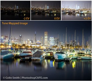
Learn what HDR really is and isn’t. It’s all explained in this free tutorial. I have just completely updated the...
Today I had the honor to attend the VIP advance preview of the Digital Darkroom exhibit at the Annenberg Space for...
