One of the biggest things I have seen destroy a nice design is bad use of typography.
A block of text should be inviting to read and not look like a chore. I’m going to provide a few principles and tips to help you avoid a lot of common typography mistakes. This isn’t a comprehensive article on the art of typography, it’s more of a “quick tips for better type design” kind of thing. I don’t like to use the word “rules”, because it makes people think they will go to jail for breaking them. I prefer the term principles, because they are a guide to help, not hinder you from great looking design. Remember these aren’t set in stone, they are suggestions, but as they say, “You first have to know the rules before you can break them”
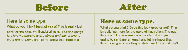
One of the biggest mistakes that people make, is to use too many typefaces and styles. Try to limit any piece to 2 or 3 different type faces and styles. This means that the body should all be one font and size. Choose one header and stick to it, maybe a subhead as well. Don’t be afraid to make the fonts very different from each other. Using 2 very similar fonts can look like you made a mistake and accidently chose the wrong font.
Consider keeping color, spacing etc, consistent or it looks like drunk flies walking all over the page.
Be careful not to crowd the typography. If you are having problems fitting something in, resist the urge to squish it together. Select a condensed font, or just shrink everything down and allow some breathing space. This applies to the edge of the page too, allow some white space around the text.
Please don’t just throw everything center aligned (unless that’s a deliberate design decision). Think about using a grid. Have everything on the page in relation to something else. Use guides and clean things up. Don’t throw things in the corners of a page either, that looks like you couldn’t decide where to put anything.

You’ve found a nice decorative font, wonderful! Now, that doesn’t mean that it will reinforce your message, and at all costs, resist the urge to set paragraph text in that face. If it’s decorative, chances are, it has a history or a specific use, such as a headline or title. Often times, simple is better, that’s why fonts like Helvetica are so popular.


Really think about the size of the text. Titles are nice bold and large, but if you set your paragraph too large, it tends to feel cheap. Think about it. You go to a nice restaurant and the menus are often written in smaller print, it makes it feel classy. (Make sure it’s not so small it’s hard to read). If you are using heading and paragraph text, don’t be afraid to make the headings much larger than the body.

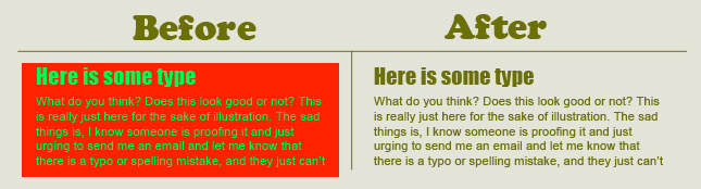
Whatever you do, make sure that people can read your message. Dark text on a dark color, not a good idea. Even worse, tying to apply small type over a high contrast photo. Remember less is more, this has never been truer than behind text that is supposed to communicate a message.

What color is best for type? Generally, believe it or not, black or white is often best. Why would I say that? Because the grayscale tones are pushed to very strong values. If you use color, consider muting the saturation a bit. Brightly colored type can be difficult to read. Beware of vibrating colors such as a red directly on a green. Rainbow colored gradients are probably not your best choice.
Group related pieces of information together. This will clean things up a lot. Examples: Look at a movie poster, all the credits are grouped into an attractive block. This block can now be treated as a single design element. For examples of bad grouping, open the yellow pages.

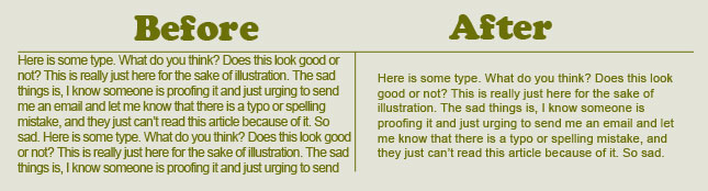
This is the spacing between lines of text. It’s much classier to open up the spacing. It’s more inviting to read when there is resting space for the eyes in between lines. As a rule of thumb, try to use at least 2 points higher than the type size. For example: 10pt type should have a 12pt leading for maximum readability.

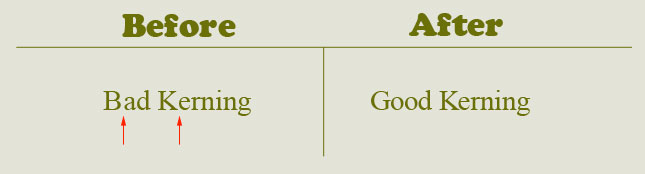
Kerning is the individual spacing between characters. Often when using Photoshop, with a cap followed by a lower case, the spacing is too wide. It should be even between characters. I like to do it this way, look at the first 3 characters and adjust the balance if needed. Now move onto character 2-4 and adjust #4 if you need to. Work your way through 3 characters at a time. After a while, you will instinctively see when the kerning is messed up. Don’t EVER change the aspect ratio of a character, don’t stretch or squish it. (I don’t know who put controls into software that allow you to do this, very, very bad) – choose a different font if you don’t like the shape.
PS Tip: To change the Kerning, place the text “I-beam” between 2 characters. Hold down the Alt/Option key and tap the left or right arrow keys to nudge the kerning. (The type has to be applied first)

Try and apply these tips as you design anything with type. In fact, well-designed type should be able to stand on it’s own and look nice without any images. At best, you want your type to reinforce your design and pull people in. It should be inviting and easy to read. I know I titled this article “Colin’s Principles” they are really age old principles and most of them are common sense when you think about it.
This site uses Akismet to reduce spam. Learn how your comment data is processed.

We can create sophisticated depth of field and background blur, effects in Photoshop by creating a depth map and then...

How to Dodge and Burn areas of a photo with the Adjustment brush in Photoshop, free photoshop tutorial...

5 tips for rapidly improving efficiency and creativity in Photoshop. By following these tips, you can create professional-grade images and...


These typography tips can go a long way to helping your designs look a lot better.
before god there was comic sans
Ok so something like this?
funny