With all the hype around HTML5, CSS3, and responsive design, it’s no surprise that the hottest new features in Dreamweaver CS6 are all aimed at making it easier for web designers to create pages that adapt to small and large screens and use the latest flavors of HTML and CSS.
From the relatively minor addition of the new Web Fonts Manager, to the significant addition of the Fluid Grid Layout system, there are many reasons to upgrade to Dreamweaver CS6.
In this article, I’ll review the most significant changes you’ll find in this version of Dreamweaver, and offer a few tips and techniques to help you put them to work right away.
The most impressive new feature in Dreamweaver CS6 — and the one that’s sure to get the most ‘buzz’ — is the new Fluid Grid Layout system.
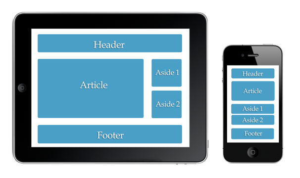
If you’re still trying to understand why you’d even need a Fluid Grid Layout and what responsive design (sometimes called adaptive design) is all about, consider this: Today’s web pages are as likely to be viewed on a tiny smartphone screen as they are to be displayed on a 27-inch Apple Thunderbolt Display.
Although you could create multiple versions of your website, each optimized to fit a different screen size, that’s a complicated and highly inefficient solution to a problem that’s only going get worse as people connect to the Internet with everything from wristwatches to refrigerators.
Responsive Design offers a far more elegant solution by creating one page that adapts to different screen sizes. Essentially, you create one HTML document and then use multiple sets of CSS rules to rearrange and resize the images, div tags, and other elements on that page to fit different screen sizes. As a browser identifies the size of each screen that visits your site, the corresponding set of style rules is automatically applied based on a media query. The @media rule for media queries is not new, web designers have long used it to associate an alternate set of styles when a web page is sent to a printer.
Dreamweaver’s new Fluid Grid Layout gives you a head start on a complex design strategy. Like most responsive designs, a fluid grid layout includes three sets of style rules:
When you use Dreamweaver’s Fluid Grid Layouts, media queries are created for you, based on the size of each device. Here’s what the media query looks like for a tablet device (note that the first line is a comment):
/* Tablet Layout: 481px to 768px. Inherits styles from: Mobile Layout. */
@media only screen and (min-width: 481px)
You’ll find the new Fluid Grid Layout option under the File menu. You’ll also find it in a new category in the New Document Window. The steps that follow will get you started with this new, adaptable approach to web design.
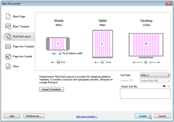
Choose File > New and in the New Document Window, select the Fluid Grid Layout category. In this dialog, you can change the number of columns that make up the grid for each of the three target sizes, you can specify the percent of the column width that is used in each of the margins between columns, and you can specify the total percentage of the browser window that will be filed by the grid layout. You can also use the DocType drop-down to select the version of HTML you want to use.
When you click Create, Dreamweaver prompts you to first save a CSS file that includes the initial styles for the page. Simultaneously, Dreamweaver saves a boilerplate CSS style sheet, and a Javascript file, which are listed in the top of the workspace. Note that the HTML file that Dreamweaver generates is not saved in this initial step.

At the bottom of the workspace, you can switch from one layout to the other, using three tiny icons which represent the Mobile size, Tablet size, and Desktop size designs. When you change from one layout to another, the corresponding CSS is applied to the document displayed in Dreamweaver’s workspace. Remember, you’re only working on one HTML file, but because Dreamweaver creates three sets of styles, you can rearrange and resize the elements to create three different layouts.
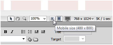
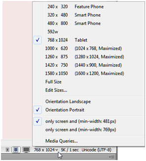
You can change the display size of any of the target devices by clicking on the Window Size arrow at the bottom of the workspace, and selecting a preset screen size. Window sizes can be edited in the Window Sizes category of the Preferences dialog.
You can add text and insert images into your pages as you would any other web page, but to take best advantage of the automated features in these fluid grid layouts, you should only add div tags by using the Insert Fluid Grid Layout Div tag, available from the Layout Insert Panel. Also note, you cannot nest Layout Div tags in your Fluid Grid designs, and that all of your layout div tags need to be contained within the main div tag on the page, which is formatted with the a class style gridContainer.

As you add Fluid Grid Layout divs, you can resize them by clicking and dragging on the corners of each div. As you resize them, the divs will automatically snap to the closest grid line. Warning: If you view the corresponding styles that are automatically created in code view, you will see that the sizes are specified to the fourth decimal point, like this: width: 48.2758%. Resist the urge to round off these numbers. If you change these numbers in code view, Dreamweaver will no longer automatically adjust them for you.
Tip: When you resize a layout div by dragging from right to left, you make the div physically smaller. When you drag from left to right, you add margin space to the left side.
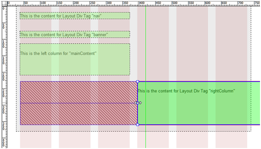
To create multiple columns, click on the small arrow to the right of any resized div. After a div is moved up, a new arrow appears in the bottom left that you can use to move it back down.

Remember, the key to creating responsive designs is to position the same divs for best display in each of the three layouts. For example, in the mobile version, the best practice is to create a single-column layout, but in the tablet and desktop versions, you may want to position the same divs to create two or more columns.
Another welcome addition to the world of web design is the ability to use almost any font to format the text on your pages. However, before I tell you about the new Web Fonts Manager in Dreamweaver CS6, I should warn you that you may not need it. In the ever-evolving way of the web, there are two basic ways to work with fonts:
If you use the fonts at Typekit.com, which was recently acquired by Adobe, you don’t need host your own fonts and, as a result, you won’t need the new Web Fonts Manager in Dreamweaver. With Adobe Typekit, you create a collection of the fonts you want to use at Typekit.com, then simply use them in your styles. When you publish your pages to a server, the fonts are automatically made available.
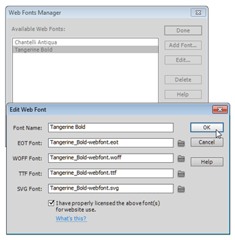
You only need Dreamweaver’s new Web Fonts Manager if you host your own fonts on your own server. There are two challenges with this option: first, you need the legal rights not only to use the font, but to publish it to a web server (check the fine print), and second, you have to host each font in four different versions if you want your fonts to display properly in all of the latest web browsers on both Mac and Windows. You can solve all of the challenges of managing font formats and rights if you use a service such as FontSquirrel.
Download one of the many @fontface font kits from FontSquirrel.com and unzip the font folder.
Choose Modify > Web Fonts, and click on the Add Font button in the Web Fonts Manager dialog window.
Select each of the font types using the Edit Web Font dialog. FontSquirrel’s font kits come complete with all four of the font types you’ll need. If you save all four font types in one folder, Dreamweaver makes it easy to link to all of them at once. Just select the first by clicking on the small folder icon in Edit Web Font dialog, and Dreamweaver will find and load all four types automatically
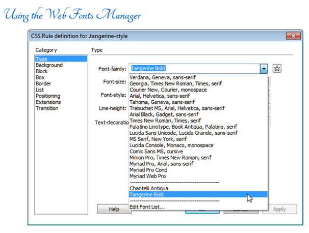
Use the font in a style rule definition. Any fonts you add using the Web Fonts Manager are automatically included in the Font-family drop-down list in the CSS Rule definition dialog. This makes it easy to add those fonts to your style rule definitions.
After you define a style rule that uses your fancy new font, you can apply that style as you’d apply any other style in Dreamweaver. Just remember that you won’t see that font displayed in Dreamweaver until you click the Live button at the top left of the workspace, or preview the page in a web browser.
When you add fonts using the Web Font Manager, Dreamweaver automatically creates a webfonts folder and stores them in your local site folder. Make sure that when you upload the page where the font appears, you also upload the webfonts folder to your server.
One of the most eye-catching aspects of CSS3 is the ability to create transitions. With CSS3 Transitions, you can change a style property from one state to another, over a specified period of time. You can create dramatic effects by using Transitions, such as making an image disappear quickly, or slowly fade away, when someone clicks on it. You can even create simple animations by changing the position of an image (or everything in a div tag) from one location on a page to another using a Transition.
You can set up Transitions with a variety of triggers, including the active link state (on mouse click) or hover link (on mouse over), and you can use Transitions to make common actions on a web page happen more smoothly. For example, instead of having a link change color from blue to yellow when a visitor rolls a cursor over it, you can transition through a series of colors. Similarly, you can use a Transition to make a drop-down menu ease open, instead of popping open in one abrupt action.
One of my favorite uses of a CSS Transition is to create a cross-fade between two photographs. You used to have to use JavaScript and a lot of complicated code to create a fade, but thanks to CSS3, you can now achieve this effect by placing one image on top of another and then gradually reducing the opacity of the first image from 100% to 0.
Dreamweaver CS6 adds two new features to help you create CSS3 Transitions: a new CSS Transitions panel, and a new Transitions Category in the CSS Rules Definition dialog. As with anything in CSS3, there are a few steps to setting up a cross-fade.
Insert two images into the same place on a page. To achieve this overlapping of images, I inserted a div tag into the page and inserted both, one above the other, using Insert > Image. Here’s what the code looks like:


To position one image above the other and set up the opacity, I defined these corresponding styles in my style sheet.
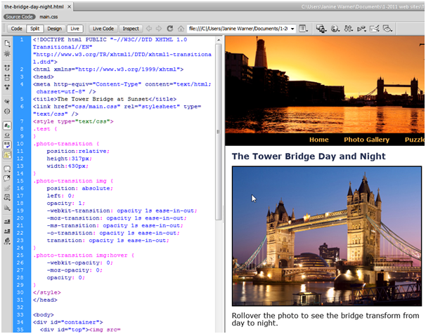
.photo-transition {position: relative; height: 317px; width: 430px;}
.photo-transition img {position: absolute; left: 0; opacity: 1;}
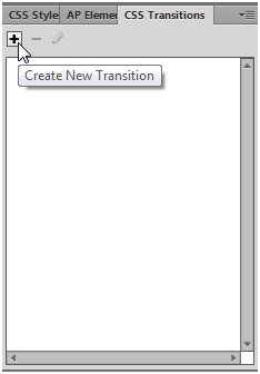
With my images in place, I opened the CSS Transitions panel by choosing Window > CSS Transitions. Like other panels, it can be floated on the screen or docked at the side. I find it fits in well with the CSS Styles and AP Elements panels.
To create a new transition, click the plus (+) in the CSS Transitions panel, and the New Transition dialog opens.
As you can see in this figure, I selected the style .photo-transition img that I had already created as the target rule. Then, I used the Transition On drop-down list to set the transition to begin on mouse over by choose hover. I set the Duration to 1 second, the timing function to ease-in-out, and the end value to 0.
Note that because I’d already set the opacity in the style to 1, setting the End value for the Opacity property to 0 is what causes the top photo to fade out when a visitor rolls a cursor over the image.
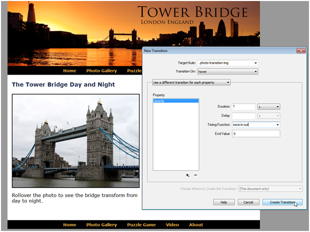
Photo credit: Tower Bridge photos from istockphoto.com.
In this figure, note how the second image becomes visible when the transition is complete. In the code, shown in the left side of this figure, you can see that Dreamweaver has created the CSS needed for all four of most popular web browsers using their respective browser prefixes: webkit for Google Chrome and Apple Safari, moz for Mozilla Firefox, ms for Microsoft Internet Explorer, and O for Opera.
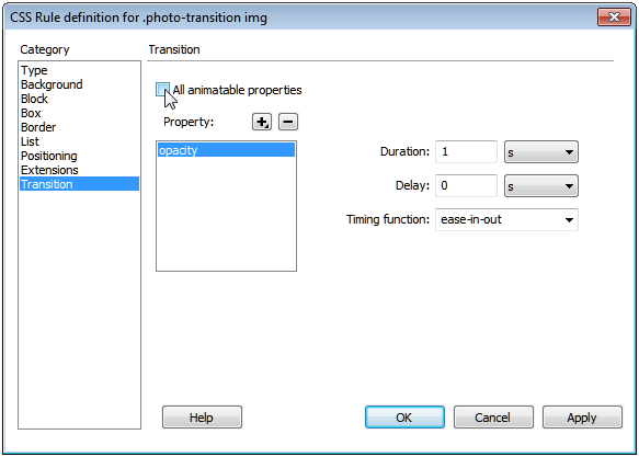
You can further refine your transitions using the CSS Transitions category in the CSS Rule definition dialog. This dialog includes an All animatable properties checkbox, which you can use to apply the Transition to multiple properties at once.
Although Adobe included these features for the most popular CSS3 design options to Dreamweaver CS5.5, I wanted to include a few quick tips about how to use them in this SuperGuide, because many Dreamweaver users skipped version CS5.5, and I don’t want you to miss these important additions when you upgrade to CS6.
You can create class or ID styles with text shadows or drop shadows, and you can add shadows to existing HTML elements by defining a tag style, such as the style I created for the
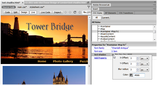
When you create rules that include text shadows you can specify up to four values. The horizontal and vertical fields specify the distance the drop shadow extends below (horizontal) and to the sides (vertical) of the text. The blur radius specifies the amount of blur in the shadow. The color of the shadow can be defined using a hexadecimal color code or as an RGBa color code.
You can add a text shadow using the Property pane at the bottom of the CSS Styles panel, as shown in this figure. To do so, follow these steps:
Click to select the name of a style in the CSS styles panel.
Click the Add Property link in the left side of the CSS Styles Property pane
Select the property name, text-shadow, from the drop-down list, or type it into the field.
After the name appears in the left side of the pane, a small arrow appears on the right. Click to select the arrow and open the text-shadow settings.
Enter the X and Y offsets, blur radius, and color, and press Return/Enter. Note: you can have the text shadow appear above or to the left of the text by entering negative numbers, such as -3, in the X and Y fields.
Dreamweaver automatically generates the CSS3 code that creates that text shadow and includes it in the selected style rule definition.
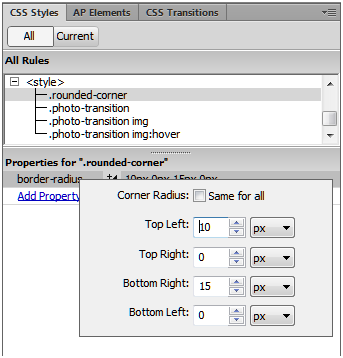
Similarly, if you want to add rounded corners to a style, or almost any other CSS3 style rule, you first select the name of an existing style in the CSS Styles panel, then click Add Property in the CSS Styles pane and choose the name of the property. For rounded corners, you add the property Border-Radius. Dreamweaver CS5.5 and CS6 include pop-up dialogs, like the one shown here, to help you create the style rules for these popular CSS3 options.
One of my biggest frustrations with Dreamweaver CS6 (and version 5.5 for that matter) is that design view, which is supposed to show you what your web page will look like in a web browser, is woefully outdated. As a result, when your pages are displayed in design view, they look like they are displayed in a very old web browser, which means you won’t see any of your CSS3 style rules applied, and elements in your layout may not line up the way they will in the latest web browsers.
To get a better idea of what your page will look like in the latest versions of Chrome, Safari, and other browsers, you’ll need to click on the Live button at the top of the main workspace.

Unfortunately, many of Dreamweaver’s editing functions don’t work in Live View, so you’ll need to click the Live button again to go back to editing your page. With a little practice, you can get used to compensating for these design differences, but it does make Dreamweaver’s design view a less than ideal place to, well, design web pages.
And remember, to fully test what your web pages will look to your visitors, you must test your pages in at least the last few versions of all of the most popular web browsers. For that, Adobe’s BrowserLab, which you can use by choosing File > Preview in Browser > Adobe BrowserLab is a great tool because it enables you to preview your designs in a variety of web browsers before you publish them on the web.
JANINE WARNER

This site uses Akismet to reduce spam. Learn how your comment data is processed.

What's new in Photoshop 25.5.1 March 2024 update. How to update Photoshop ...

Check out the new Parametric Filters in Photoshop, ultimate guide to Parametric Filters in Photoshop...

By Colin Smith Welcome to our CS6 launch site. We have gathered the best talent in the industry to discuss...


Dear Ms. Warner,
Thank you for your explanation with Dreamweaver Cs6 with the new fluid grid layouts and the thorough explanation of how to see fonts added in your website and adding radius and drop shadows. It is most appreciated. I’m building a website currently with Cs6 and with the fluid grid layout. I’m hopping you can answer a question I have, which is my banner image is different for my desktop layout and also the phone layout. I tried to input the background-image:………; different for both the phone and desktop. Two different images. My banner for the desktop is much larger and wider than my thumbnail banner for the phone version. However after I added two different images on the style sheet it’s not showing two different images when I view multi screen view or switch to the live view. Thanks so much for any information that you can offer. My Email is [email protected]